5 Inspiring Wireframe Examples for Your Website or Mobile App

Wireframes can be very useful in the process of designing UX. Learn more about their advantages.

Wojtek23 Apr 20205 min
5 Inspiring Wireframe Examples for Your Website or Mobile App

There is more to a website or app than just attractive pictures, eye-pleasing colours and fancy fonts. There is something less eye-catching, but definitely as, if not even more, important; the framework.

The process of creating a framework starts with an idea. But how do you translate it into a functional and user-friendly product? And how do you make the creative process less complicated and time-consuming?

One of many possible and useful solutions is using wireframes. You can use wireframes to plan the layout and the functionality to improve UX.

Both low-fidelity (basic and less detailed) or high-fidelity (more precise and detailed) wireframes can be helpful in the process of designing UX, and consequently, improve the final product.

Let’s dive into the world of wireframes!

Benefits of wireframing

Why do we even bother with creating a wireframe?

1. It visualises the structure clearly

Simplicity is the ultimate sophistication, where less means more. Wireframes encapsulate these two expressions and make use of it.

They simply present a general outline and are easy to comprehend even for less experienced users. They take abstract concepts and turn them into tangible solutions that can be tested and assessed.

2. It helps to navigate

How many times have you struggled to navigate through apps or websites? Probably too many. How many times have you decided to simply click away and search for information somewhere else? Let me take a guess; probably also many times.

Intuitive navigation is the key to a satisfied user and a reduced bounce rate. Even if your website or app offers top quality content, no one will actually get to this unless you make it approachable. Don’t test your users’ patience - test your wireframes!

3. It pushes usability to the front

Without a doubt, one of the biggest advantages of wireframes is the fact that they allow you to focus totally and exclusively on usability and user experience. The criterion is simple: either it works, or it doesn’t.

Wireframes don’t distract you with attractive images and fancy colours; you can objectively assess the usability itself.

4. It helps to identify some problems early

The simplicity of wireframes allows you to conduct tests and eliminate potential problems and mistakes at the very beginning of the process of creating websites or apps.

Wireframes are cost-effective and straightforward, meaning they allow you to use a fast-fail approach, thus eliminating and replacing problematic issues. The fast-fail approach saves time and consequently money, as well as the risk of a future failure.

5 Wireframe Examples that you need for your website or mobile app.

YOGO Trip Planner App by Julie Truong
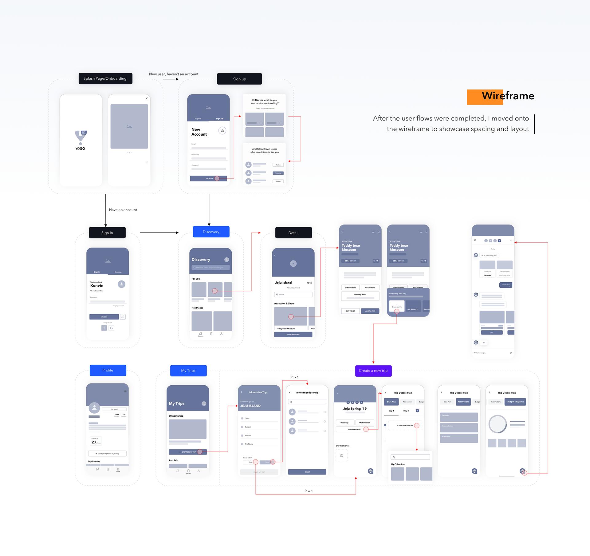
YOGO answers the needs of avid travellers. It is designed to improve two main purposes of this app: searching and planning. Thanks to the focus on these two actions, it implements simple and effective navigation.

As a high-fidelity wireframe, not only does it show the basic layout, but also a more precise representation of the final design. It is a highly advanced project that features many details, and it almost looks like a finished product.

Shella by Mari Pet

Shella is a wireframe allowing you to create an online shop. It is clear, minimal and easy to use, yet is still powerful and diversified. It offers the possibility to create banners, advanced filters and product swatches.

Shella can be easily customised and responds to different needs and demands. Without sacrificing quality, it implements simple modification. It is also mobile-optimised.

Pawtastic by Meagan Fisher, Kylle Galle, Lindsay Munro
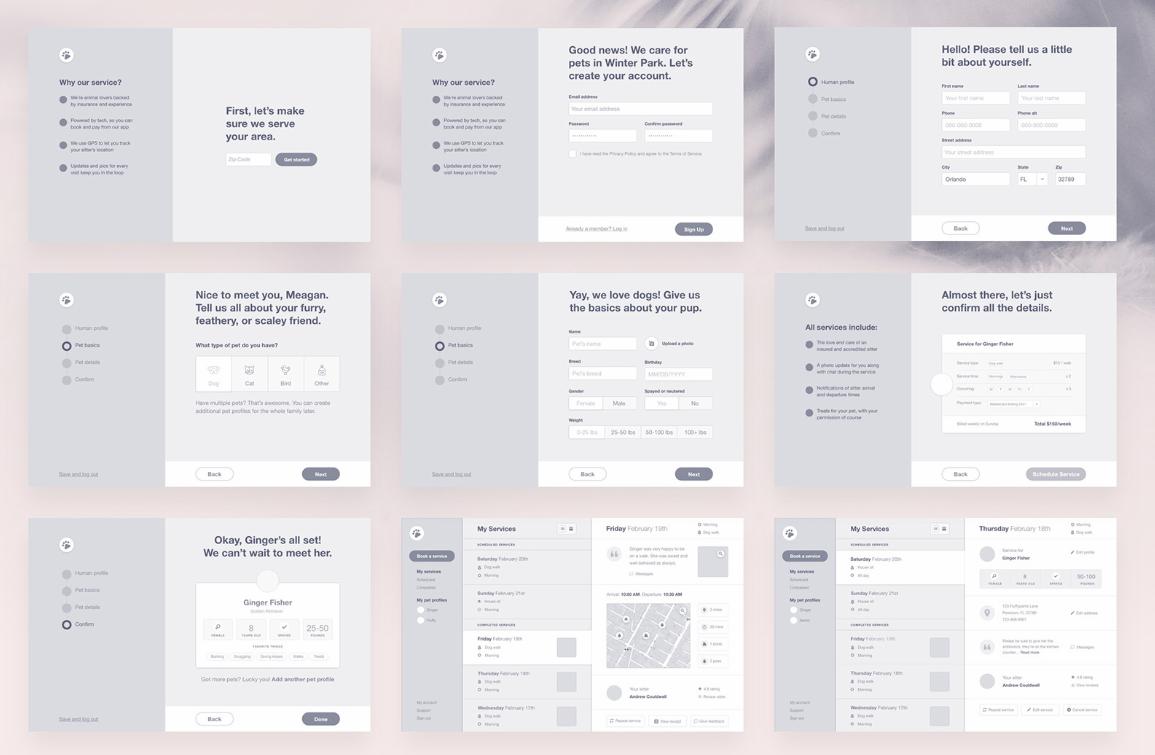
Who doesn’t love pets? Pawtastic is a web app prototype for animal lovers who want to organise their pet care.

It implements a bunch of various useful features; planner for walks, human and pet profiles, vet appointment reminders; you name it. I also have to mention the pleasing-to-the-eye design and ease of customisation. Pawtastic uses a simple marketing page design and makes it fun!

Meditation Mobile App by Elena Novikova

Created by Elena Novikova, Meditation Mobile App mixes friendly navigation with eye-catching design. Simple at its form and limited with features, this wireframe doesn’t distract you with unnecessary details.

Its layout perfectly corresponds with its theme. It is relaxing, well-organised and intuitive.

Your Home by Villi R.
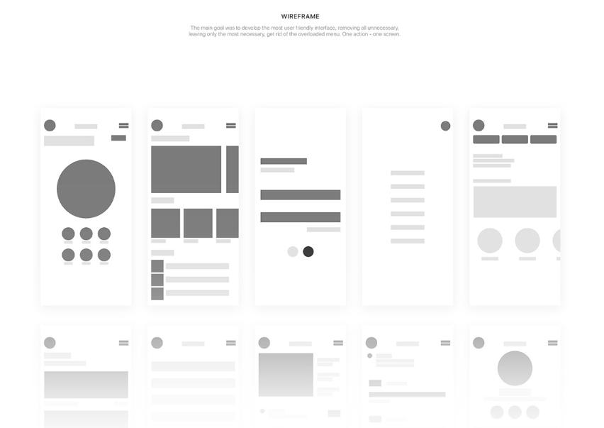
Your Home is a perfect example of the low-fidelity wireframe. Its author, Villi R, wanted to implement the idea of minimalism to his designs and to reduce the number of elements, leaving only the most important ones.

Your home is elegant, clear and user-friendly. If you want to see how this wireframe looks when applied to the final design, take a look at Villi’s case study on behance.net.

Are wireframes necessary?

Even though wireframes incorporate some useful features, they also come with limitations. Once a wireframe is approved, it is especially difficult to change it due to formalities. To avoid this type of constraint, the general tendency is to search for different solutions.

With wireframing being a valid option, there are also alternatives, such as prototyping or whiteboarding. So if you don’t feel comfortable with using wireframes, you don’t have to limit yourself.

Conclusion

Taking everything into consideration, even though the market is evolving, and there are many alternatives. Wireframes still have their advantages and can come in handy during the process of creating a website or an app.

It is not the newest and not the most innovative tool; however, if you are looking for a basic and reliable method, wireframes can help. They are simple yet effective and can improve and speed up your projects.

If you are looking for interesting ideas and projects, make sure to check Behance or Dribbble to get inspired!

Read more articles

Our Clients

Grenton PL — TicketCounter NL — insureQ DE — ZAiKS PL — NordicTechHouse SE — BusyLamp DE — Holo4labs PL — DMARCSaaS NL — Plan.net DE — eSecure PL — eWinner PL — Conversion UK — TAP SA — 

Grenton PL — TicketCounter NL — insureQ DE — ZAiKS PL — NordicTechHouse SE — BusyLamp DE — Holo4labs PL — DMARCSaaS NL — Plan.net DE — eSecure PL — eWinner PL — Conversion UK — TAP SA — 

UX Posters project

UX does not have to be serious or boring. UX can be gripping, exciting and witty. Download free hires movie inspired UX posters or buy prints.

uxposters.com.jpg

5 Inspiring Wireframe Examples for Your Website or Mobile App

Wireframes can be very useful in the process of designing UX. Learn more about their advantages.

Wojtek23 Apr 20205 min
5 Inspiring Wireframe Examples for Your Website or Mobile App

There is more to a website or app than just attractive pictures, eye-pleasing colours and fancy fonts. There is something less eye-catching, but definitely as, if not even more, important; the framework.

The process of creating a framework starts with an idea. But how do you translate it into a functional and user-friendly product? And how do you make the creative process less complicated and time-consuming?

One of many possible and useful solutions is using wireframes. You can use wireframes to plan the layout and the functionality to improve UX.

Both low-fidelity (basic and less detailed) or high-fidelity (more precise and detailed) wireframes can be helpful in the process of designing UX, and consequently, improve the final product.

Let’s dive into the world of wireframes!

Benefits of wireframing

Why do we even bother with creating a wireframe?

1. It visualises the structure clearly

Simplicity is the ultimate sophistication, where less means more. Wireframes encapsulate these two expressions and make use of it.

They simply present a general outline and are easy to comprehend even for less experienced users. They take abstract concepts and turn them into tangible solutions that can be tested and assessed.

2. It helps to navigate

How many times have you struggled to navigate through apps or websites? Probably too many. How many times have you decided to simply click away and search for information somewhere else? Let me take a guess; probably also many times.

Intuitive navigation is the key to a satisfied user and a reduced bounce rate. Even if your website or app offers top quality content, no one will actually get to this unless you make it approachable. Don’t test your users’ patience - test your wireframes!

3. It pushes usability to the front

Without a doubt, one of the biggest advantages of wireframes is the fact that they allow you to focus totally and exclusively on usability and user experience. The criterion is simple: either it works, or it doesn’t.

Wireframes don’t distract you with attractive images and fancy colours; you can objectively assess the usability itself.

4. It helps to identify some problems early

The simplicity of wireframes allows you to conduct tests and eliminate potential problems and mistakes at the very beginning of the process of creating websites or apps.

Wireframes are cost-effective and straightforward, meaning they allow you to use a fast-fail approach, thus eliminating and replacing problematic issues. The fast-fail approach saves time and consequently money, as well as the risk of a future failure.

5 Wireframe Examples that you need for your website or mobile app.

YOGO Trip Planner App by Julie Truong

YOGO answers the needs of avid travellers. It is designed to improve two main purposes of this app: searching and planning. Thanks to the focus on these two actions, it implements simple and effective navigation.

As a high-fidelity wireframe, not only does it show the basic layout, but also a more precise representation of the final design. It is a highly advanced project that features many details, and it almost looks like a finished product.

Shella by Mari Pet

Shella is a wireframe allowing you to create an online shop. It is clear, minimal and easy to use, yet is still powerful and diversified. It offers the possibility to create banners, advanced filters and product swatches.

Shella can be easily customised and responds to different needs and demands. Without sacrificing quality, it implements simple modification. It is also mobile-optimised.

Pawtastic by Meagan Fisher, Kylle Galle, Lindsay Munro

Who doesn’t love pets? Pawtastic is a web app prototype for animal lovers who want to organise their pet care.

It implements a bunch of various useful features; planner for walks, human and pet profiles, vet appointment reminders; you name it. I also have to mention the pleasing-to-the-eye design and ease of customisation. Pawtastic uses a simple marketing page design and makes it fun!

Meditation Mobile App by Elena Novikova

Created by Elena Novikova, Meditation Mobile App mixes friendly navigation with eye-catching design. Simple at its form and limited with features, this wireframe doesn’t distract you with unnecessary details.

Its layout perfectly corresponds with its theme. It is relaxing, well-organised and intuitive.

Your Home by Villi R.

Your Home is a perfect example of the low-fidelity wireframe. Its author, Villi R, wanted to implement the idea of minimalism to his designs and to reduce the number of elements, leaving only the most important ones.

Your home is elegant, clear and user-friendly. If you want to see how this wireframe looks when applied to the final design, take a look at Villi’s case study on behance.net.

Are wireframes necessary?

Even though wireframes incorporate some useful features, they also come with limitations. Once a wireframe is approved, it is especially difficult to change it due to formalities. To avoid this type of constraint, the general tendency is to search for different solutions.

With wireframing being a valid option, there are also alternatives, such as prototyping or whiteboarding. So if you don’t feel comfortable with using wireframes, you don’t have to limit yourself.

Conclusion

Taking everything into consideration, even though the market is evolving, and there are many alternatives. Wireframes still have their advantages and can come in handy during the process of creating a website or an app.

It is not the newest and not the most innovative tool; however, if you are looking for a basic and reliable method, wireframes can help. They are simple yet effective and can improve and speed up your projects.

If you are looking for interesting ideas and projects, make sure to check Behance or Dribbble to get inspired!

Read more articles

Our Clients

Grenton PL — TicketCounter NL — insureQ DE — ZAiKS PL — NordicTechHouse SE — BusyLamp DE — Holo4labs PL — DMARCSaaS NL — Plan.net DE — eSecure PL — eWinner PL — Conversion UK — TAP SA — 

Grenton PL — TicketCounter NL — insureQ DE — ZAiKS PL — NordicTechHouse SE — BusyLamp DE — Holo4labs PL — DMARCSaaS NL — Plan.net DE — eSecure PL — eWinner PL — Conversion UK — TAP SA — 

UX Posters project

UX does not have to be serious or boring. UX can be gripping, exciting and witty. Download free hires movie inspired UX posters or buy prints.

uxposters.com.jpg