Tips for Designing SaaS Application (with Examples)

Learn how to design SaaS tool with this examples of marketing solutions.

Dariusz13 Feb 20204 min
Tips for Designing SaaS Application (with Examples)

Online marketers are at the forefront of SaaS tools users. As this can sound like a bold statement, consider the multiple needs that marketing SaaS solutions solve for professionals responsible for online marketing.

The tools range from:

  • to-do lists,
  • content and social media calendars,
  • proofing tools such as Grammarly,
  • social media monitoring,
  • simple design tools like Canva or Pablo by Buffer.

That’s just the tip of the iceberg - the list can be even longer!

As marketers use tools like these on a daily basis, it makes them a very solid, but also demanding user base. Once you win their hearts (and subscriptions), they can stay with you for a long time.

If, however, they will discover a similar solution, but even better – they won’t hesitate to try it out and ditch you.

To make the latter option a lot less possible, here are three tips for designing marketing SaaS tools that you need to know.

Designing SaaS tools for online marketers

1. Focus on collaboration

Marketers work within teams, sharing their work with peers, managers, sales teams, etc. It may include reviews, proofreading, getting things accepted.

This is the reason why SaaS application should always foster teamwork, whether it’s sharing reports or simultaneous collaboration. Consider this as a principle for this example: if a user can share what they are doing, you’re on the right path.

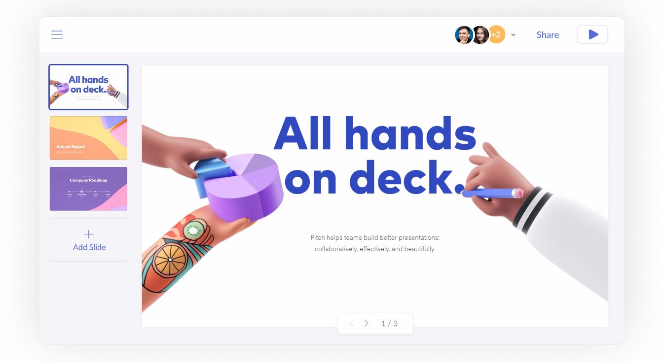
For Pitch, collaborative presentation software, sharing one's work is the backbone of their product. Using Pitch, users can work together on a single presentation, exchange comments, and track the workflow of each task.
2. Reinforce data with a clear design

Modern marketers are data-driven. They use many sources of information about their clients, prospects, or users. Designing a SaaS tool, make sure that it translates raw data into the informative and visually compelling way.

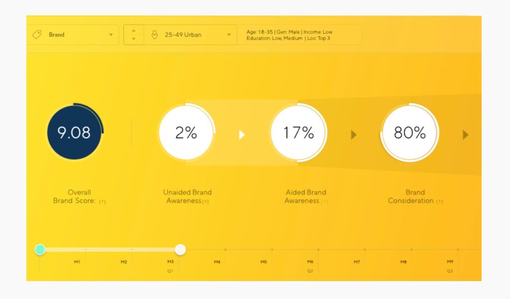
Dalia, for example, is a survey attribution platform collecting billions of data worldwide. One of their tools, Latana, uses advanced data science to allow brand tracking. Marketers, however, are rarely skilled data scientists, so what Latana does, is it translates collected data into easy to use charts and insights.
Marketers often struggle to properly attribute the data they have to draw actionable conclusions. Visual representation of data makes it way easier to get insights marketers need. Zeotap offers a tool for publishers that turn subscriber’s data into personalised recommendations.
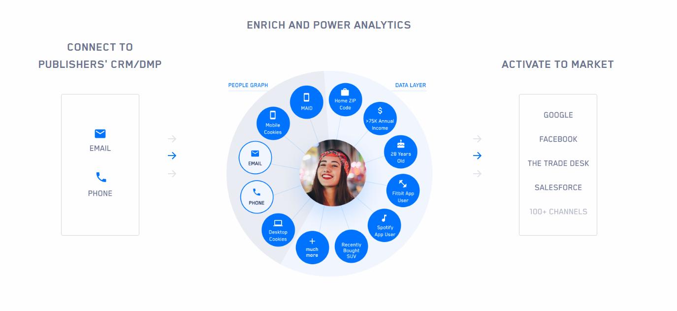
Designing a tool using data visualisation, consider not only charts or graphs. Sometimes simple icons can tell more than rows of data in the spreadsheet.

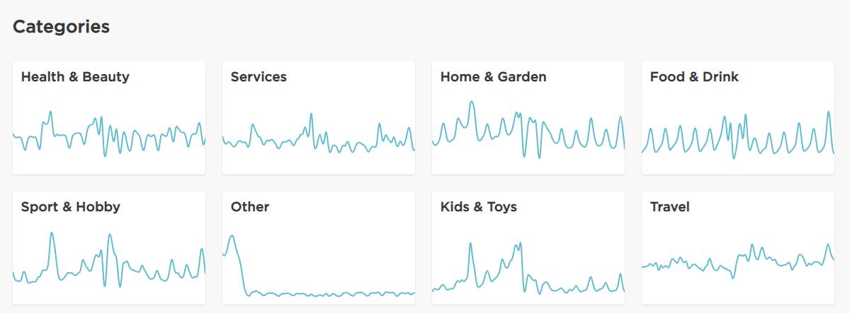
Another tool that turns customer data into simple graphs is Meniga. Sometimes simple visuals are best, and this is a perfect example, as Meniga Consumer Trends makes it very easy to quickly find insights on shopping trends.
3. Perform usability tests

Designing a SaaS application, invest some time to perform usability testing. As they are often managing many tasks at once, tools for marketers tend to have multiple advanced features. Tools for marketing automation or customer relationship management software are a good example.

CrossEngage, for instance, combines a real-time customer data platform with cross-channel campaign management. It requires multiple integrations of data sources and marketing channels. To design a tool like this, collaborate closely with your audience.

  • What insights are most important?
  • What is the hierarchy of information?
  • How to structure different data to offer a comprehensive platform?

You can find examples online, but it’s always best to ask your target audience what they need.

But what if your user’s audience should be your concern? As it may sound like Inception’s scenario, this might be the case with tools like Mavenoid. This tool offers automated troubleshooting using Artificial Intelligence. Working on a similar project, you can use insights from your client and test with their target audience. Remote usability tests are perfect for this approach.

Put your users first

As a designer, always put your users first – or their users, if that’s the case. Whether it’s clear UI, data visualisation, or information architecture, testing your assumption with beta testers is a way to go. To switch from idea-driven approach to creating for actual users, read our article on user-centred design.

Read more articles

Our Clients

Grenton PL — TicketCounter NL — insureQ DE — ZAiKS PL — NordicTechHouse SE — BusyLamp DE — Holo4labs PL — DMARCSaaS NL — Plan.net DE — eSecure PL — eWinner PL — Conversion UK — TAP SA — 

Grenton PL — TicketCounter NL — insureQ DE — ZAiKS PL — NordicTechHouse SE — BusyLamp DE — Holo4labs PL — DMARCSaaS NL — Plan.net DE — eSecure PL — eWinner PL — Conversion UK — TAP SA — 

UX Posters project

UX does not have to be serious or boring. UX can be gripping, exciting and witty. Download free hires movie inspired UX posters or buy prints.

uxposters.com.jpg

Tips for Designing SaaS Application (with Examples)

Learn how to design SaaS tool with this examples of marketing solutions.

Dariusz13 Feb 20204 min
Tips for Designing SaaS Application (with Examples)

Online marketers are at the forefront of SaaS tools users. As this can sound like a bold statement, consider the multiple needs that marketing SaaS solutions solve for professionals responsible for online marketing.

The tools range from:

  • to-do lists,
  • content and social media calendars,
  • proofing tools such as Grammarly,
  • social media monitoring,
  • simple design tools like Canva or Pablo by Buffer.

That’s just the tip of the iceberg - the list can be even longer!

As marketers use tools like these on a daily basis, it makes them a very solid, but also demanding user base. Once you win their hearts (and subscriptions), they can stay with you for a long time.

If, however, they will discover a similar solution, but even better – they won’t hesitate to try it out and ditch you.

To make the latter option a lot less possible, here are three tips for designing marketing SaaS tools that you need to know.

Designing SaaS tools for online marketers

1. Focus on collaboration

Marketers work within teams, sharing their work with peers, managers, sales teams, etc. It may include reviews, proofreading, getting things accepted.

This is the reason why SaaS application should always foster teamwork, whether it’s sharing reports or simultaneous collaboration. Consider this as a principle for this example: if a user can share what they are doing, you’re on the right path.

For Pitch, collaborative presentation software, sharing one's work is the backbone of their product. Using Pitch, users can work together on a single presentation, exchange comments, and track the workflow of each task.

2. Reinforce data with a clear design

Modern marketers are data-driven. They use many sources of information about their clients, prospects, or users. Designing a SaaS tool, make sure that it translates raw data into the informative and visually compelling way.

Dalia, for example, is a survey attribution platform collecting billions of data worldwide. One of their tools, Latana, uses advanced data science to allow brand tracking. Marketers, however, are rarely skilled data scientists, so what Latana does, is it translates collected data into easy to use charts and insights.

Marketers often struggle to properly attribute the data they have to draw actionable conclusions. Visual representation of data makes it way easier to get insights marketers need. Zeotap offers a tool for publishers that turn subscriber’s data into personalised recommendations.

Designing a tool using data visualisation, consider not only charts or graphs. Sometimes simple icons can tell more than rows of data in the spreadsheet.

Another tool that turns customer data into simple graphs is Meniga. Sometimes simple visuals are best, and this is a perfect example, as Meniga Consumer Trends makes it very easy to quickly find insights on shopping trends.

3. Perform usability tests

Designing a SaaS application, invest some time to perform usability testing. As they are often managing many tasks at once, tools for marketers tend to have multiple advanced features. Tools for marketing automation or customer relationship management software are a good example.

CrossEngage, for instance, combines a real-time customer data platform with cross-channel campaign management. It requires multiple integrations of data sources and marketing channels. To design a tool like this, collaborate closely with your audience.

  • What insights are most important?
  • What is the hierarchy of information?
  • How to structure different data to offer a comprehensive platform?

You can find examples online, but it’s always best to ask your target audience what they need.

But what if your user’s audience should be your concern? As it may sound like Inception’s scenario, this might be the case with tools like Mavenoid. This tool offers automated troubleshooting using Artificial Intelligence. Working on a similar project, you can use insights from your client and test with their target audience. Remote usability tests are perfect for this approach.

Put your users first

As a designer, always put your users first – or their users, if that’s the case. Whether it’s clear UI, data visualisation, or information architecture, testing your assumption with beta testers is a way to go. To switch from idea-driven approach to creating for actual users, read our article on user-centred design.
Read more articles

Our Clients

Grenton PL — TicketCounter NL — insureQ DE — ZAiKS PL — NordicTechHouse SE — BusyLamp DE — Holo4labs PL — DMARCSaaS NL — Plan.net DE — eSecure PL — eWinner PL — Conversion UK — TAP SA — 

Grenton PL — TicketCounter NL — insureQ DE — ZAiKS PL — NordicTechHouse SE — BusyLamp DE — Holo4labs PL — DMARCSaaS NL — Plan.net DE — eSecure PL — eWinner PL — Conversion UK — TAP SA — 

UX Posters project

UX does not have to be serious or boring. UX can be gripping, exciting and witty. Download free hires movie inspired UX posters or buy prints.

uxposters.com.jpg