My Love-Hate Relationship: the Hamburger Menu

The Hamburger Menu is one of the digital world’s most iconic symbols. Here's why I love it, and hate it.

Wojtek27 Aug 20206 min
My Love-Hate Relationship: the Hamburger Menu

UX is an art like no-other. In many ways, a truly tantalising UX experience brings an interaction with a brand into a whole new dimension. The feeling one evokes from the navigating an App, Website, or Desktop programme very, incredibly easily transcends into the branding experience.

But, I think it’s best we got to the main act. That’s before we reach into psycho-physical aspects of the end-user experience.

Admirable Features?

There’s an abundance of features which I admire. As design gets more sophisticated, we’re able to make things which are both attractive and functional.

I’m naming things that come to mind. There’s the endless scroll, found across social media and news outlets on every platform. There are the famed pinch & flick gesture controls, used from everything to navigating maps, to gaming.

Some device gestures have even become synonymous with social reward. For the Tinderella’s out there, swipe right can mean falling in love!

But then, there are the obsolete features. ‘Shake and Undo’, I’m talking about you. Just on a side note, who’s still using this? I switched mine off years ago, but that feature keeps coming back.

Soul Searching

My point is, there are features that are loved by UX designers, enterprise clients, and end users. There’s even empirical evidence. That’s right, Stanford University-level evidence stating that to ‘Zoom in’ is a more amenable gesture compared to ‘Zoom Out’.

But even that evidence is based on pre-ordained gestures, a set list, if you will. The same goes for digital features. Have we ever considered the possibility of better alternatives to some of the digital world’s most popular features?

The reason I’m asking this broad question is simple. Some features are beginning to feel exhausting. And when bad UX results in improper feature implementation – then I get frustrated. There’s one that I have in mind.

The Hamburger Menu

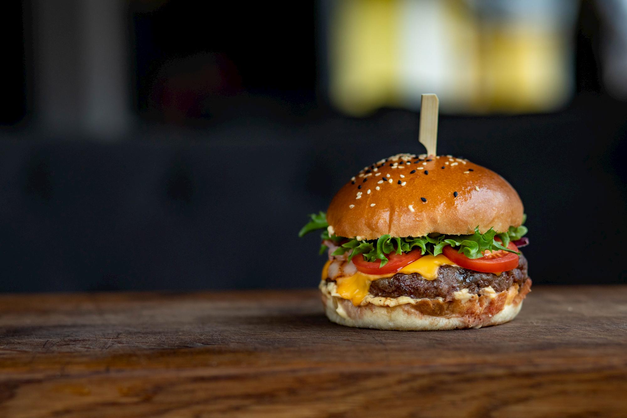
No, I don’t want fries with that. It’s a symbol, if anything. The logo on the top left, or right corner of websites and apps. Those horizontal lines are configured to look like … now you get it. Its purpose is to act as a shortcut to all the possible menu options.

I’ll try to be objective for a moment. As far as what it’s meant to achieve, the menu should make for easy navigation. It’s aim is to better present information that your app, site, etc seeks to convey. It has become ubiquitous in the design process, and is instantly recognisable. But in many ways, it fails in its duty to the user.

If what they want is a great User Experience – then why would you take that away, Hamburger menu? Are you a genuinely misguided element? No. It can be good, in the right hands. It’s because the people that put you there, didn’t know what they were doing…

Some aspects in particular have profound effects on UX.

Exhausting Process of Element Discovery

Discoverability is a casualty in these hamburger wars. Many seem to hide elements, or project them in an uninteresting fashion. When fashioning the entire experience into mind, sometimes broader gestures should lead to objectives. That is, scrolling through a site, and navigating should in-theory provide the answers people need.

The problem with the menu is it hinders the organic discover of items. Because if all the info is stashed within the hamburger – then what point is there in the rest of the site? One pet peeve I have are the navigational links hidden inside of this menu.

Lazy Appearance and Design

There’s much to create in the UX realm! Swiping, sliding, gliding, and transforming. I could go on all day… The creative potential is enormous, as is the using of talent to achieve this. So why opt for a stiff, rigid list of items that pops out from the side of the screen?

Not only does it seem to miss the theme in many cases, but it has other drawbacks in the UI sphere. The very area which it covers can encroach on the entire screen. Mismatched proportions are one of many lax features. Put that on your hamburger menu!

Horrific Accessibility

Mobile means convenience. When we forget that, we might as well close our laptops for the day. Menus frequently flank the top of the screen, often tucked in the corner. For those of us (all of us) who use a smartphone with our thumbs, some places are hard to reach.

There’s also the matter of inconsistent scrolling speed when navigating to a previous menu. That can also require assistance from another finger. These sound like mundane, tedious details. But remember, they are important ones. UX is measured in microseconds, each moment is critical.

Keep Doing it. But Do it Right.

Who doesn’t love the hamburger menu? We do! Surprised?

Oh, it’s up there. But it takes a central role, as it blends with the overall UX. That should be a guiding principle. Everything should be included for a purpose. The hamburger menu is a key navigation tool. It is necessary to experience the page from the outset.

Here’s some advice to keep it effective:

  • Be consistent – when implementing it, keep design and content in-line with your overall UX and UI.
  • Make it reachable – people should be able to reach your menu item. Make sure to place it within the user thumb range. In the scheme of things, keep overall intuition at a good level.
  • Maintain the style – it’s a good idea to keep a similar experience going. Take care to maintain a similar experience within the menu itself. Don’t just stamp out static menu options! If your app is fluid, then keep the menu fluid too.

Go Beyond Fast Food

As I’ve been saying – the list of possibilities is endless!

Let’s get to basics. Not every menu has to be a dropdown rectangle. In fact, why not make it circular? Perhaps a pop-up navigation panel could achieve your UX objectives? Emerging features such as voice, or even facial recognition could power user experience too!

A great example could be a gesture-activated, 4-element menu that can be accessed by 2-finger swipes in any of the compass point directions. But the fact is, there are multiple possibilities of short-cutting the navigation process. The hamburger menu is exceptional, but only when carried out correctly.

Take the above advice into account and avoid the traps into which many UX designers seem to fall. Choose carefully and consider choosing a UX partner that knows this. Reach out, and we can be here to help!
Read more articles

Our Clients

Grenton PL — TicketCounter NL — insureQ DE — ZAiKS PL — NordicTechHouse SE — BusyLamp DE — Holo4labs PL — DMARCSaaS NL — Plan.net DE — eSecure PL — eWinner PL — Conversion UK — TAP SA — 

Grenton PL — TicketCounter NL — insureQ DE — ZAiKS PL — NordicTechHouse SE — BusyLamp DE — Holo4labs PL — DMARCSaaS NL — Plan.net DE — eSecure PL — eWinner PL — Conversion UK — TAP SA — 

UX Posters project

UX does not have to be serious or boring. UX can be gripping, exciting and witty. Download free hires movie inspired UX posters or buy prints.

uxposters.com.jpg

My Love-Hate Relationship: the Hamburger Menu

The Hamburger Menu is one of the digital world’s most iconic symbols. Here's why I love it, and hate it.

Wojtek27 Aug 20206 min
My Love-Hate Relationship: the Hamburger Menu

UX is an art like no-other. In many ways, a truly tantalising UX experience brings an interaction with a brand into a whole new dimension. The feeling one evokes from the navigating an App, Website, or Desktop programme very, incredibly easily transcends into the branding experience.

But, I think it’s best we got to the main act. That’s before we reach into psycho-physical aspects of the end-user experience.

Admirable Features?

There’s an abundance of features which I admire. As design gets more sophisticated, we’re able to make things which are both attractive and functional.

I’m naming things that come to mind. There’s the endless scroll, found across social media and news outlets on every platform. There are the famed pinch & flick gesture controls, used from everything to navigating maps, to gaming.

Some device gestures have even become synonymous with social reward. For the Tinderella’s out there, swipe right can mean falling in love!

But then, there are the obsolete features. ‘Shake and Undo’, I’m talking about you. Just on a side note, who’s still using this? I switched mine off years ago, but that feature keeps coming back.

Soul Searching

My point is, there are features that are loved by UX designers, enterprise clients, and end users. There’s even empirical evidence. That’s right, Stanford University-level evidence stating that to ‘Zoom in’ is a more amenable gesture compared to ‘Zoom Out’.

But even that evidence is based on pre-ordained gestures, a set list, if you will. The same goes for digital features. Have we ever considered the possibility of better alternatives to some of the digital world’s most popular features?

The reason I’m asking this broad question is simple. Some features are beginning to feel exhausting. And when bad UX results in improper feature implementation – then I get frustrated. There’s one that I have in mind.

The Hamburger Menu

No, I don’t want fries with that. It’s a symbol, if anything. The logo on the top left, or right corner of websites and apps. Those horizontal lines are configured to look like … now you get it. Its purpose is to act as a shortcut to all the possible menu options.

I’ll try to be objective for a moment. As far as what it’s meant to achieve, the menu should make for easy navigation. It’s aim is to better present information that your app, site, etc seeks to convey. It has become ubiquitous in the design process, and is instantly recognisable. But in many ways, it fails in its duty to the user.

If what they want is a great User Experience – then why would you take that away, Hamburger menu? Are you a genuinely misguided element? No. It can be good, in the right hands. It’s because the people that put you there, didn’t know what they were doing…

Some aspects in particular have profound effects on UX.

Exhausting Process of Element Discovery

Discoverability is a casualty in these hamburger wars. Many seem to hide elements, or project them in an uninteresting fashion. When fashioning the entire experience into mind, sometimes broader gestures should lead to objectives. That is, scrolling through a site, and navigating should in-theory provide the answers people need.

The problem with the menu is it hinders the organic discover of items. Because if all the info is stashed within the hamburger – then what point is there in the rest of the site? One pet peeve I have are the navigational links hidden inside of this menu.

Lazy Appearance and Design

There’s much to create in the UX realm! Swiping, sliding, gliding, and transforming. I could go on all day… The creative potential is enormous, as is the using of talent to achieve this. So why opt for a stiff, rigid list of items that pops out from the side of the screen?

Not only does it seem to miss the theme in many cases, but it has other drawbacks in the UI sphere. The very area which it covers can encroach on the entire screen. Mismatched proportions are one of many lax features. Put that on your hamburger menu!

Horrific Accessibility

Mobile means convenience. When we forget that, we might as well close our laptops for the day. Menus frequently flank the top of the screen, often tucked in the corner. For those of us (all of us) who use a smartphone with our thumbs, some places are hard to reach.

There’s also the matter of inconsistent scrolling speed when navigating to a previous menu. That can also require assistance from another finger. These sound like mundane, tedious details. But remember, they are important ones. UX is measured in microseconds, each moment is critical.

Keep Doing it. But Do it Right.

Who doesn’t love the hamburger menu? We do! Surprised?

Oh, it’s up there. But it takes a central role, as it blends with the overall UX. That should be a guiding principle. Everything should be included for a purpose. The hamburger menu is a key navigation tool. It is necessary to experience the page from the outset.

Here’s some advice to keep it effective:

  • Be consistent – when implementing it, keep design and content in-line with your overall UX and UI.
  • Make it reachable – people should be able to reach your menu item. Make sure to place it within the user thumb range. In the scheme of things, keep overall intuition at a good level.
  • Maintain the style – it’s a good idea to keep a similar experience going. Take care to maintain a similar experience within the menu itself. Don’t just stamp out static menu options! If your app is fluid, then keep the menu fluid too.

Go Beyond Fast Food

As I’ve been saying – the list of possibilities is endless!

Let’s get to basics. Not every menu has to be a dropdown rectangle. In fact, why not make it circular? Perhaps a pop-up navigation panel could achieve your UX objectives? Emerging features such as voice, or even facial recognition could power user experience too!

A great example could be a gesture-activated, 4-element menu that can be accessed by 2-finger swipes in any of the compass point directions. But the fact is, there are multiple possibilities of short-cutting the navigation process. The hamburger menu is exceptional, but only when carried out correctly.

Take the above advice into account and avoid the traps into which many UX designers seem to fall. Choose carefully and consider choosing a UX partner that knows this. Reach out, and we can be here to help!
Read more articles

Our Clients

Grenton PL — TicketCounter NL — insureQ DE — ZAiKS PL — NordicTechHouse SE — BusyLamp DE — Holo4labs PL — DMARCSaaS NL — Plan.net DE — eSecure PL — eWinner PL — Conversion UK — TAP SA — 

Grenton PL — TicketCounter NL — insureQ DE — ZAiKS PL — NordicTechHouse SE — BusyLamp DE — Holo4labs PL — DMARCSaaS NL — Plan.net DE — eSecure PL — eWinner PL — Conversion UK — TAP SA — 

UX Posters project

UX does not have to be serious or boring. UX can be gripping, exciting and witty. Download free hires movie inspired UX posters or buy prints.

uxposters.com.jpg