Good design is as little design as possible. – Dieter Rams
Yet, it’s easier said than done. Very often product owners and designers tend to overcomplicate the product, adding this ‘one more feature’, or this ‘one more element to the page’.
In search of the product that fully answers your users’ needs, it’s easy to get caught in a spiral of endless modifications. While in turn, the design process is as much about building up, as it is about having the courage to remove needless things.
Let’s find out what makes a project overdesigned, and how to avoid it.
Why do we overcomplicate design?
Overcomplicating what might be a good design is not a result of designers’ malevolence. In fact, it’s usually the opposite—it’s the pursuit of perfect design that leads to an overdesigned product.
Typically, you can avoid overdesigning by watching for these red flags:
No clear goals
Designing your product with just a rough idea is one way to overdesign your product. Without clear goals and objectives, it’s easy to try to add ‘more and more’ elements and features that you think are essential. The truth is—in most cases, they aren’t.
Setting clear goals and objectives gives you a roadmap of your project. They state what’s important for your product’s success, so that you and your design team need only to include what’s necessary and get rid of anything else.
Before you start designing your product, create a document with a list of goals your project has to achieve and make sure to stick to it throughout the project.
No project owner
Too many cooks spoil the broth—this saying is also true in product design. With lots of comments, suggestions, and points of view within a team, it’s easy to lose sight of the initial idea. That’s why it’s a good idea to have one person in charge of the product, who makes a final call.
The project owner is a person that looks after the project, checking if the goals and objectives are met. To make sure your design won’t get off-track, always include this role in the design team.
Miscommunication
Working with your own team, with freelancers, or with a remote team, you need to establish the right communication process. Otherwise, there’s a risk of miscommunicating important elements, not getting the message across, or receiving a misleading answer.
Fear not—as communication mistakes happen, you can easily avoid them by ensuring that questions and answers are clear:
- Ask questions – if you’re not sure about something or the message is not clear, ask. It’s better to double-check if you got something correctly than to fix mistakes later on.
- Confirm answers – similar to asking questions, always make sure that you and your team are on the same page when it comes to understanding messages shared across the team.
The pursuit of the ideal
As the saying the best is the enemy of the good doesn’t mean you shouldn’t strive to get the best results possible, it’s often true when designing a product. Designers and clients want the product to be perfect, and in this pursuit of the ideal, it’s easy to overcomplicate simple things.
While designing a product, have the Pareto principle in mind—80% of the outcomes come from just 20% of the effort.
Design thinking to the rescue
Apart from knowing which habits lead to overcomplicating a good design, I suggest you follow a design thinking process. It will help you to better understand your user, form assumptions, test them, and design a product that answers real-life problems.
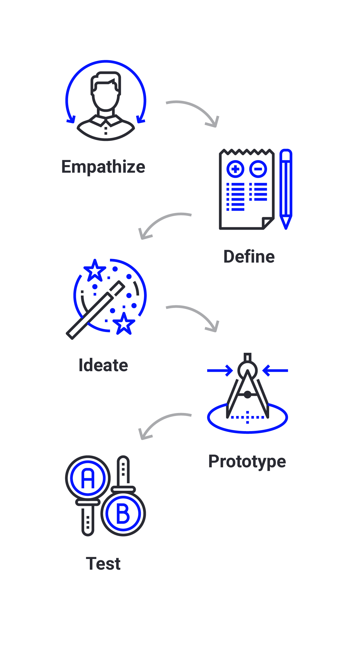
Design thinking process consists of 5 iterative phases:
- Empathise – try to get into your user’s shoes
- Define - figure your users’ needs, problems, gather insights.
- Ideate – come up with assumptions and ideas for your design.
- Prototype – create a rough prototype of your solution.
- Test – gather feedback to see if your assumptions are correct.
With design thinking, you end up with an idea that solves real-life problems and meets actual needs. It removes the guessing from your project, so you can focus on designing what matters for your users.
Start small and build up. Cautiously.
Armed with a list of things to avoid and a process that gives you insights on what your users need, you can start designing your product. This time, however, you can create one that is free of unnecessary ornaments or features.
Start small
The mistake designers and their clients often make are focusing on things that don’t matter at the time. For example, they tend to pay too much attention to polishing the buttons, the navbar, or the typography, while they don’t have a conception for the entire site.
By starting small and then building up, you assure that the project consists only of the required features (conception). Next, you can focus on completing a preliminary design, and—once it’s approved—on adding final touches to the project (detailed design).
Iterate
Design is an iterative process. You can create something, and then revisit your work based on new insights.
It also allows you to create a general version first, to later add more and more elements, if required. With iterative approach to design, you won’t get stuck with polishing your header and forgetting about the rest of the website or an app.
Remember, however, not to lose sight of what you want to achieve—the list of project goals and objectives can be very handy in this case.
Simplify your design
Overdesigned design creates visual clutter. By reducing the number of elements or adding white space, you can do the opposite.
But how to distinguish a purposeful simplicity from banality? A simple design doesn't mean tearing your preliminary design down just for the sake of limiting the number of elements. A simple design means that only the necessary things get included in your final design.
When in doubt, ask yourself a question about the value each element brings to your design. If something doesn’t serve your user, remove it.
Be critical
When designing a product, it’s easy to get excited about it— and it’s then, that everything you add seems necessary. That’s understandable, as the design is like a designer’s child. Though, you should try to think about your project from your users’ perspective. Be critical about it, and if you can’t, get some constructive feedback.
Ready to create a well-design product?
Designing a product that serves your users, is understandable and accessible, is a difficult thing to do. It is worth it, though, to put some extra work and focus on elements that bring real value to your users. In the end, it is even more satisfying than creating something beautiful, but overdesigned and complicated for the ones that were meant to use it.
Bad design examples are everywhere – by reducing visual clutter from your website, you already stand out from the crowd.
Need a hand designing your project? Reach out to us, and let’s build a valuable product together.
