Here are some common form problems that can cause user frustration and how to fix them:
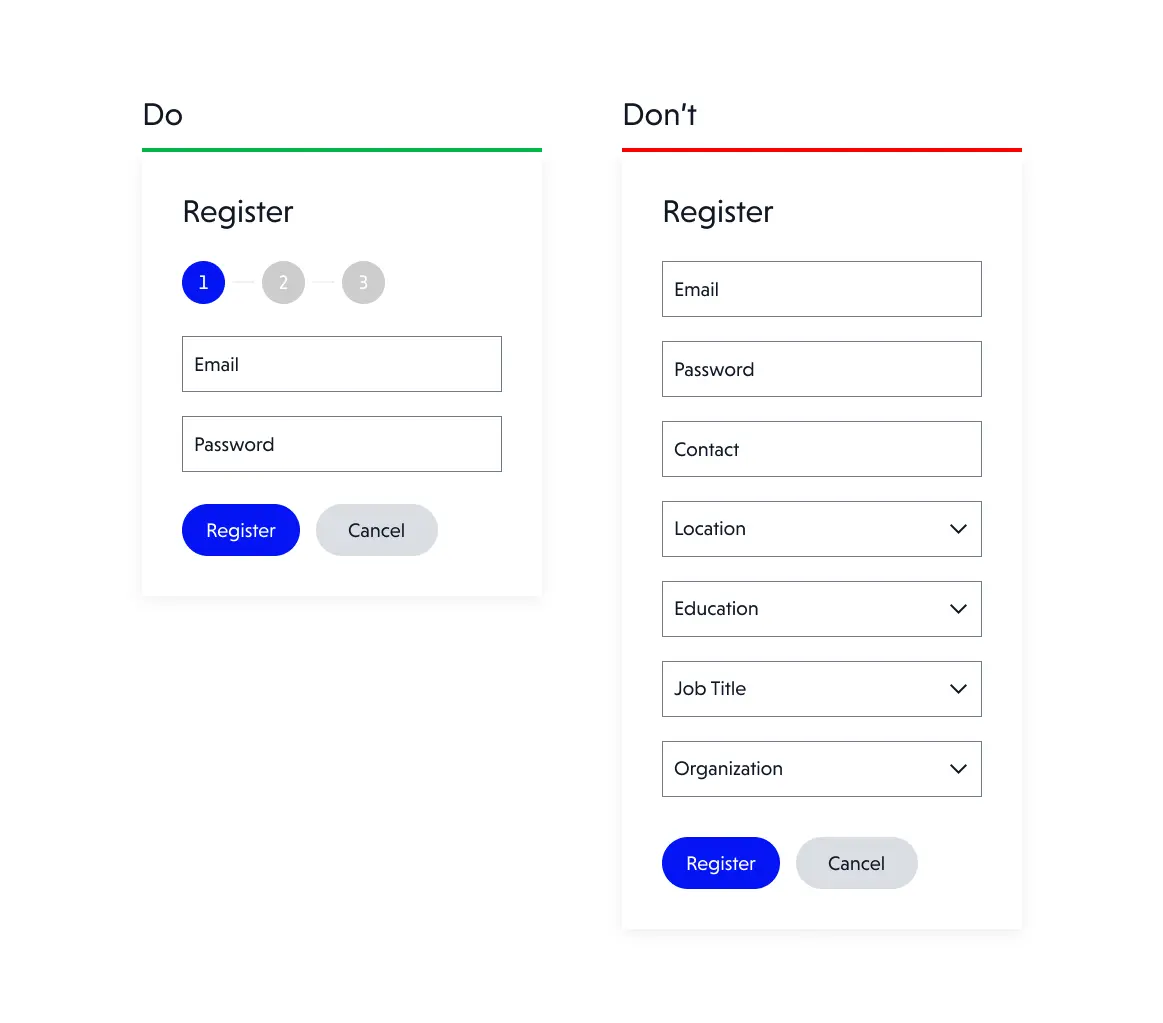
1. Unnecessary fields complicate the form
Having too many fields in a form can be overwhelming for users, especially if all fields are marked as mandatory. This increases time and causes unwillingness to enter a lot of data.
How to solve it:
Keep it simple. Consider asking for only the necessary information and explicitly checking optional fields. You can also hide unnecessary fields until they are needed, for example on checkout forms, you show an additional field for the delivery address, only if you indicate that it is different from the billing address. Furthermore, if forms are really huge, and you can’t minimize the number of fields, divide the form into several steps. Make sure to display the number of steps remaining and the status of the form completion process in a clear manner at all times.

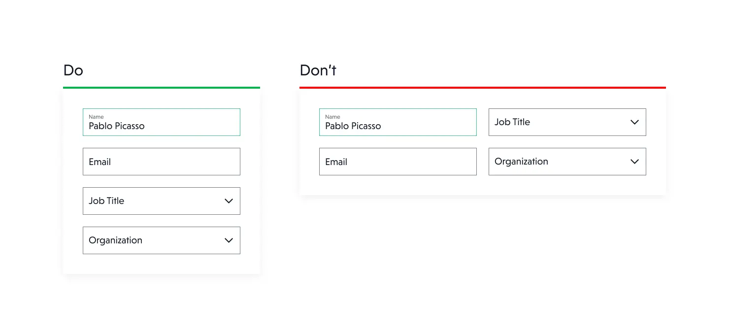
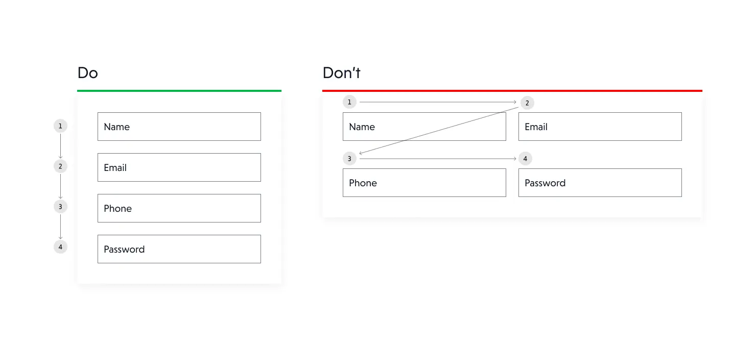
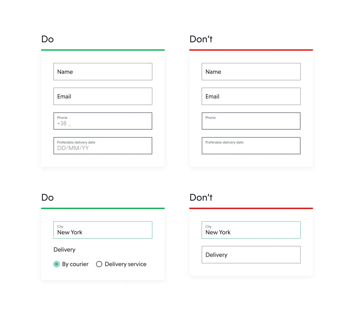
2. Two, three or four columns – it’s too much
Have you come across forms with two, three, or even four columns? We have, and we have made an observation that such formats go against how users tend to read content.
How to solve it:
To fix this problem, single-column forms that allow for smooth and quick field completion are recommended. City and zip code, on the other hand, can be placed next to each other without disrupting the user's flow.

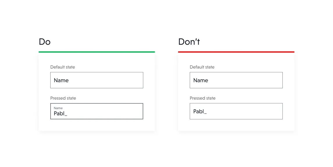
3. Labels not always visible
When designing forms, there is a tendency to show labels only if the user is not focused on the field. This is problematic especially for longer, multi-field forms.
How to solve it:
If you have a place to show labels, do it. It's good for the user to see what data he should enter in a particular field.

4. Don't make it difficult to answer questions
Don't overload the user, if some questions can be answered without having to enter a field, give the user that option. Consider what questions can be open and what questions can be closed.
How to solve it:
Consider open vs. closed answers. Closed answers are better as they reduce workload, errors, and aid interpretation. For closed answers, use dropdowns for long lists, radio buttons for single-choice, and checkboxes for multiple-choice. Some questions like names, addresses, and phone numbers must be typed individually by the user. For phone number and date birth don’t forget used masked inpunt.

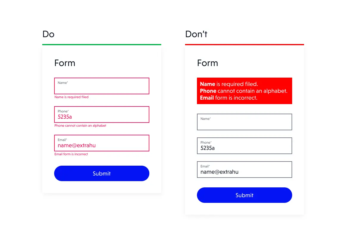
5. Take care of effective error validation
Error validation is a key aspect of form design and usability. Users rely on forms to submit information accurately and efficiently, and when errors occur, it can be frustrating and time-consuming.
How to solve it:
To provide a better user experience, forms should be designed with clear and concise error messages that are displayed prominently and offer action tips to correct the error. For effective error validation, use clear language and specific guidance to fix errors. Highlight the relevant fields and provide real-time feedback to avoid repeating errors.

Next time, recognize whether your form is requesting too much from the user. Consider the potential consequences for your business.
- Too many fields/steps in the form will cause some users to abandon the process, at the expense of losing sales and leads.
- Users will also drop out if I have to answer questions, they consider irrelevant. Is it always necessary to provide e.g., a date of birth?
- Remember that first impressions are only made once; if a user went through a complicated form but was frustrated with the process, they may never return to you.
To sum up
Remember these five basic rules when designing a form:
- Include only the fields that are absolutely necessary in the form. A form with too many fields discourages the user.
- Create single-column forms with fields arranged sequentially; only logically related fields, such the city and postal code, may be placed adjacent to one another.
- Especially for lengthy forms, form field labels should always be displayed.
- Make it simple for the user to fill up the form by using checkboxes, radio buttons, dropdowns, or mask inputs as appropriate.
- Effective validation is critical. To avoid repeat errors, use clear and concise error messages, highlight relevant fields, and provide real-time feedback.