People are getting picky with their apps. And they should be! The number of apps on any given app stores is in the millions.
That’s a technical ecosystem run very much by jungle law. The better the app, the better its share of the market. That lion’s share can be vital to an app’s survival.
What’s Mobile UI, You Ask?
It stands for ‘User Interface’. And there’s little more to it than the aesthetic and functioning of mobile applications. When we use the term Mobile UI, we’re, of course referring to mobile and handheld tablet devices.
Wait, isn’t this Mobile UX?
Mobile UX sounds similar. But in this case, we’d be referring to how users interact with your product.
How Important is the Mobile Platform?
Think of any reason why you would prefer to complete something via mobile, and you’ve answered your own question. But what’s more important to note, is that it’s a massive market.
Mobile boasted a 53.3% market share in combined web traffic in 2019. This compares to 16.2% in 2013. Businesses have noticed, and you will be hard-pressed to find a website without an equally-matching mobile version.
Apps matter too. At the end of the last decade, the size of the iOS’ App Store offering exceeded 3 million. 900,000 of these were gaming applications. As we can see, the market is substantial.
It doesn’t take an expert to note that it’s good to be ahead of the curve. App and Mobile web designers scramble to be the next best thing. It’s one thing to make something aesthetic, but its another to make it functional!
What’s Already Out There
There are several types of screens to which we lend our eyes. Let’s explore some features we’re used to seeing. I’ll be sure to give my advice too!
Splash Screen
It’s the first impression of your creation. But as far as I can say, it’s not a hot item. It is just a loading screen, after all. You’ll hear a lot of opinion on the ‘optimal time’ you should show a loading screen. In one article, I read about a ‘4-8 second’ limit - bulls***. It should be shown as little as possible if its only function is loading app content. If I saw an app screen longer than 4 seconds, that app has no place on my phone.
Onboarding Tutorial
You’ve seen these. They’re the quick intro guide to an app. Sometimes they’re called ‘What’s New’, or just boringly described as ‘Tutorials’. It’s not a hot feature. If an app is complicated that it needs a tutorial … it’s a bad app! Well, unless strictly necessary as a practical function. But your objective should be to get people working it ASAP. The best tutorial is a redundant tutorial. We should make our UI self-explanatory and get users moving. As a good suggestion – we should have a variant of onboarding screen but try to combine it with a login screen adorned with a features list.
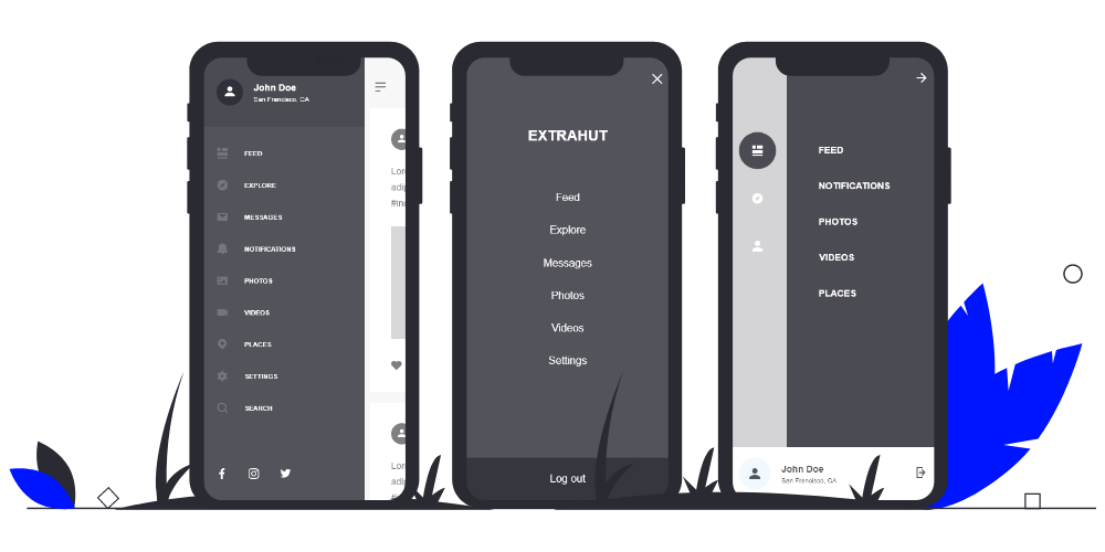
Home / Menu Screen
When we’re looking at menu panels – where are they usually located? Up high in the rafters… But that’s changing! You might notice a trend towards moving navigation panels to the bottom of the screen. That’s directly related to users’ thumb range. Ever noticed some items located at the top of a screen are hard to reach for our fingers? See the chart below to understand why it’s easier to swipe right.

The Settings Page
Like a profile page, this is your users’ personalised page. It’s a point at which they can make adjustments that suit their taste.
In some cases, users can add a nickname and even upload a photo. Some apps have moved away from the internal ‘profile’ pages. Instead, they favour linking existing social profiles. How you choose to apply that is your prerogative. Opinions regarding data collection continue to change too. Watch this space.
Stats and Dashboard
Some apps greet you with a tantalising collection of vivid graphics, graphs, and curvaceous metrics. Unless your invention is a recreation of the water meter – this might not be necessary. I stress - only use this as required. Number-heavy stats pages can detract users. If this is indeed crucial, then I’d recommend linking dashboards with the home screen. Make information digestion as easy as possible.
Very Nifty Features
The following might be a little more akin to e-commerce. But these features crossover into various mediums. The app ecosystem is a melting pot. So even if you’re not a retailer, stay with us!
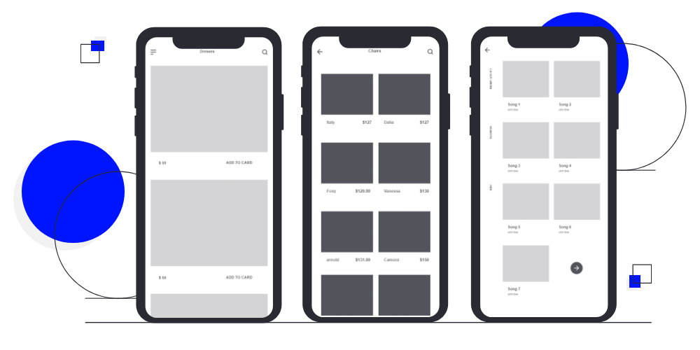
Catalogues & Coupon Screens
Catalogues are fantastic tools to display a product range. Coupon screens – not so much. I think a UI developer should do away with such nonsense. In many cases, these work best as their own standalone app. Consider keeping these worlds apart.
Product Card Screen
This screen displays technical links such as QR codes, and barcodes. It’s becoming apparent that designers focus on the photo of the product, by placing it at the centre of the screen – I disagree. What they should be doing instead is make a screen that sells the product. The ‘add to cart’ button should be visible at the start. Scrolling should not be necessary to sell an item.
Checkout / Shopping Cart
Welcome to the final summary before the ultimate jumping-off point. Making this comfortable should be your ultimate objective. There are two elements you must address. The first is profile verification. The second is a form to collect payment details. Users should feel safe. Gentle reminders, such as payment system logos, and security symbols all work to reassure users of process safety. Icons such as shields and padlocks are popular. Ensure your use of phrasing achieves the same end. Words such as ‘secure’, ‘protected’, or ‘trusted’ help drive the point.
Social Feeds
A rolling news screen, with an endless scroll. It’s the work of UX genius and retains users for longer than ever. If such a feature applies to your app, then take cues from the major social networks. A smooth interface, with only the right info, should be your objective.
How Will We ‘Build’ on these Features?
To sum up my recommendations, UI still has a way to go. Many apps, such as Shazam and Instagram, have embraced the thumb-first interface. Users should navigate with greater simplicity. The features we encounter help users to sign up, purchase goods, or perform any desired action.
Many of these features can be vital to reaching your objectives. This is called a conversion funnel. It represents a process in which developers leverage site and app features. By designing each aspect of an app’s UI, you can work to ‘smoothen’ that funnel. Once they reach their objective, you’ll have an idea as to which features work, and which need improvement. Feel free to read up on Conversion Funnel Optimisation and how it can help you achieve your aims.
So, What’s Next?
Some exciting features are making headlines. Some are making themselves affordable too. As new abilities help distinguish brands, expect brave new worlds in feature design.
Augmented reality is one such idea. For those captivated by virtual reality and wish to merge with the real world – this offers both. Overlay your content into view in retail settings, like Ikea. Carry out an experiential marketing campaign, as did Lego. Some take to the practice to create international art installations.
Try to go button-less! Smartphones already shun them – for the most part. But there’s a certain charm to a purely gesture-driven interface. Many gestures are as common as well-known hotkeys. Take pinching, and directional swiping as examples. Many phones now unlock using facial recognition too. That ability can translate to a smoother app UI.
Don’t be silent – let your users speak! Voice recognition is more intelligent than ever. The likes of Siri and Google Assistant help smoothen interactions without even the use of touch. This vocal frontier is unlikely to remain on the horizon.
Whole-screen imagery is another bold direction. Pictures may tell a thousand words, but a few key phrases can tell a thousand stories. I’m witnessing a revival in captivating typography. Type design helps to enhance an image. Because when done, correctly, you can spell even the most powerful of messages.
All in all, the mobile UI game is an exciting, bold new world of ideas. Take care to mind your objectives and apply the Conversion Funnel principles into your designs. But on a less serious note, be creative! There’s a wild west of technologies making their way – users will be keen to try them.