Are you feeling ‘blue’?
That might be due to the grey sky, or the brown leaves on the ground. Colours are a tell-tale sign of a state of being. They inspire us to take direct actions, but also have indirect implications to feelings and personal experiences.
Colours evoke properties and qualities. Brands know this and use them to advance their marketing efforts. You may not know it, but your most recent purchase decisions have probably come down to the colour of a product’s packaging. Those principles apply to web design in precisely the same way. Without a good colour strategy, you will not achieve good UX or actionable conversions.
In this article, we’ll explore colour theory, colour schemes, and the tools you can use to build a compelling – and rewarding – website.
Let’s begin our journey – in fabulous technicolour!
Fun Fact: Pantone’s 2021 colour of the year is Grey and Yellow
Don’t Avoid the Basics: Colour Theory and Colour Schemes
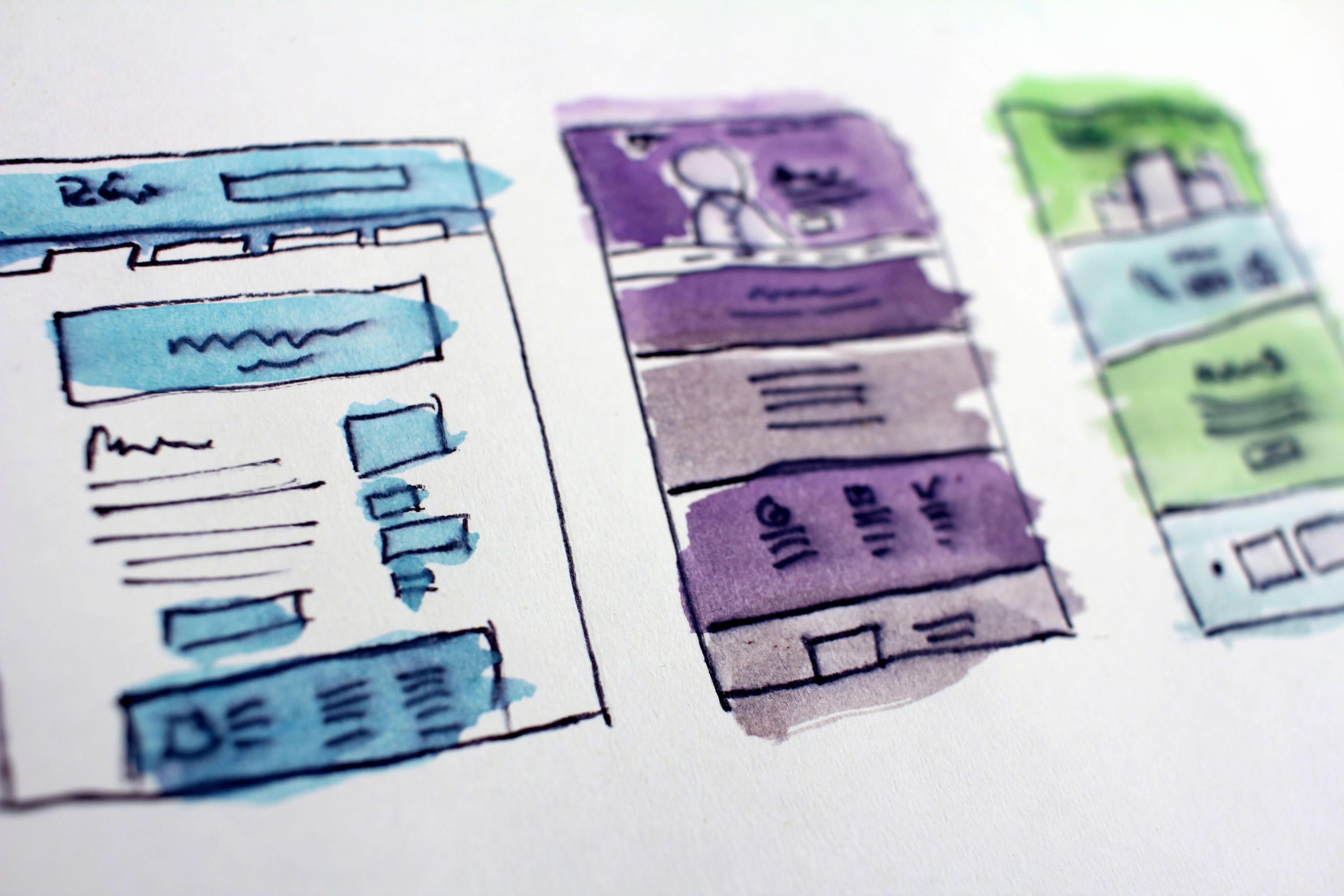
Let colour be your success. The UI of your website must adhere to certain principles. The main school of thought on this subject is titled ‘colour theory’. This is the interaction of colours within a design, carried out through:
- Complementation
- Contrast
- Vibrancy
These are a choice of colours used cohesively within design fields. There are three types of colour scheme approaches. These consist of:
- Triadic
- Compound
- Analogous
I’ll teach you what you need to know about colours and colour theory. But a humanistic and technological approach will be just as helpful.
Why Colour Theory Matters
How you choose your colours can be more important than the colours themselves. That’s because before making the most vivid and visually appealing palate you need to understand the principles. As you had read in the introduction, colour theory examines three important characteristics.
Complementation
This is to understand the colour based on its relation to others. When assigning exact opposites, or ‘polar opposites’, this creates positive associations to users. These sentiments are also known as ‘happy mediums’, in which they enjoy the design with which they are interacting.
Take care to notice that when you view contrasting colours, you may experience a natural harmony. To identify polar opposites in colour schemes, be sure to use a colour wheel.
Contrast
The disparity between visual elements consists of colour choice, levels of brightness, or shading. As with complementation, a simple change between two elements can support the UX of your website. One such useful tool is the Contrast Checker, which can help you to comply with WCAG rules. To do this, you should employ a contrast ratio of at least 4.5:1.
Optimal contrasts reduce users’ eye strain and help in overall navigation. As a rule of thumb, consider a dark backdrop for light-colour text, or vice-versa. Depending on which shade you choose, your users’ level concentration can transform dramatically.
For example, using a light background with bold, dark text, has been proven to attract higher levels of attention.
Vibrancy
We see it in the news – without knowing why, taste it outside the restaurant - before we order our food, we even hear it before we purchase the concert tickets. Well-thought-out colour combinations have the power to unleash our most subconscious desires or fears.
But these practices are what make you stand out from competitors. Bold is beautiful – with darker, bolder colours invoking emotions and sentiments that can drive users to purchase, like, subscribe, or carry out any desired action, for that matter.
Stronger banner colours invite a more forceful response from your users and are used in television, and news websites. Red also illustrates the sense of urgency and stimulation. Users are undoubtedly less focused in such instances and are emotionally-driven.

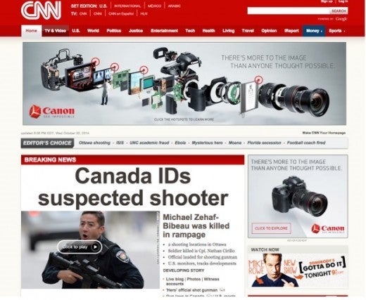
A lighter background colour, on the other hand, offers clarity to the user. Here, readers can experience increased attention and focus. The use of white evokes a sense of calm, which diminishes any possible stimulation. As a result, user emotions are likely to remain stable. This means that users will turn their attention to what matters more – the content.
Notifications, Reminders, or Serious Warnings
With this in mind, try to work vibrancy principles into your site notifications. You may want to warn or remind users of something important, but not startle them. Pale shades of colours will divert attention, but not enough to distract them from their ongoing site experience.
On the other hand, a more stern warning is also necessary. In these cases – use darker hues.
Best Colour Scheme Examples
Don’t give up on your market research, either! It isn’t enough to consider the assumed value of a colour. That’s because its meaning can indicate a certain quality in one place, whilst taking on a different meaning elsewhere.
Be especially aware of the importance of colour across different cultures. Red and Green, for instance, contrast greatly between East Asia, and the West.
Mind the Cultural Gap!
In Western culture, red denotes various extremes, mainly excitement, danger, urgency, and love. Its effect is that of mobilisation and stimulation to a viewer.
Note: Red lettering often indicates financial losses in business.
East Asian culture identifies red with somewhat fewer extreme references. More importantly, this colour represents wealth, fortune, and vitality.
Note: Red lettering often indicates financial gains in business.
Western culture associates green with mostly positive attributes, such as health, wealth, luck, and affirmation. Its appearance, and the name itself, also closely align with the natural environment, creating a holistic atmosphere.
Note: Green lettering often indicates financial gains in business.
The same cannot be said of East Asian cultures, where green links to eternity, and even infidelity. Negative stigma is strong, such that in Chinese cities, you may avoid fines for civil infractions, by agreeing to wear a green hat in public.
Note: Green lettering often indicates financial losses in business.
No Colour Scheme is Universal
Depending on where you are in the world, a colour scheme can present different feelings and impressions.
Your target audience will approach your web page individually. Colours may trigger personal memories and even prejudices. Therefore, your best bet is to abide by some universally-accepted practices. Many colour palettes you see in modern product design tend to observe well-proven theories and hypotheses.
The good news is that some colour-picking tools even make these decisions for you. Some are built into the tools that I will share with you shortly. Others are colour palette generators, which you can find through a simple Google search, Pinterest page, or Instagram channel.

Choosing a Colour Scheme
The following are the three most leading techniques, which you can use to arrive at a colour harmony. Each example demonstrates the basic colour chords, based on the colour wheel.
- Triadic – this scheme opts for colours that are spaced evenly across the colour wheel. The harmonies offer a vibrant but stark contrast to one another. For best results - be sure to let one colour appear more significantly to the remaining two.
- Compound or Split Complimentary – a solid visual contrast lets you build a colour profile from one end of the wheel, while also giving you a chance to add a ‘dash’ of distinction. If you are relatively new to the practice of colour, then consider this strategy, which is widely considered a failsafe.
- Analogous – sometimes, it is also wise to choose likeminded colours. These harmonies often work best in natural themes, as they are visually appealing to the end-user. Consider this scheme while also maintaining the principles of contrast to your web design. Use one colour to dominate just enough, to allow other design features to appear with relative ease.
Handy Colour and Design Tools
Even the most seasoned designers can take advantage of online solutions. Many such programmes are built especially with beginners in mind. These offer an intuitive, and straightforward mechanism that can even pick your colours for you. Some of the most straightforward tools available are colour capturing tools like Adobe Capture.
Consider the following tools, based on your level of experience.
Flat UI: for Beginners
This site is comfortable and attractive enough for even non-project related visits! Explore Flat UI in the most basic form, with preselected colour schemes, complete with copy formats and colour codes. I emphasise on ‘simple’, as this is a handy and practical tool.
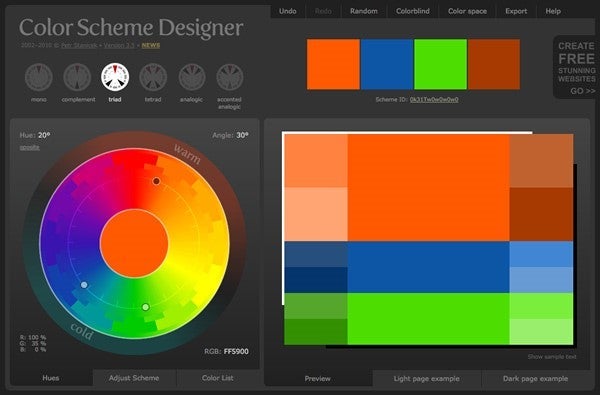
Paletton: for Novices
This site is also known, by its sensibly chosen title, ‘Colour scheme designer’, and with good reason. Paletton is a step-above Flat UI but offers the same degree of simplistic functioning – making this a suitable tool for those without a design background. This instrument generates compatible tones and presents from between the colour scheme approaches.

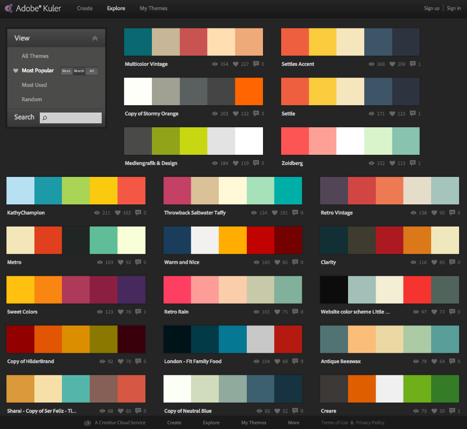
Adobe Colour CC: for Intermediates
You may know this project by its former name ‘Kuler’ and contains a broad selection of palate choices. This tool offers more possibilities - and colours - for those who know what they are doing. Use Adobe Colour CC to develop your colour palette with greater detail, and complexity.
Show Your True Colours!
Colour theory is a beautiful, but meticulously detailed science. A 10-minute read from even the most world-class designer (*ahem, ahem*) doesn’t explore the depths of the university education available on this topic.
But with the above information, you will know enough. Without a basic understanding of colour, you risk missing opportunities on your web page, as well as adversely affect your UX and UI – and brand – in the long term. When designing your website, general knowledge of colour theory can be more than enough to push your project in the right visual direction.
Remember to keep your target audience in mind, as well as the nature of your business, in-line with marketing and sales objectives. Make things that much more comfortable, using the tools available online, and feel free to reach out to specialists and designers too. These experts can apply the best practices to business knowledge and create a compelling product.
So, be bold, be brave… and feel free to dazzle the world!