Whether you’re building a website, designing e-commerce signage, or creating an app – every aspect of your digital design will need a creative backbone.
When building your brand, it will take a specific set of colours, layouts, and arrangements to communicate the right message. But it’s one thing to declare your intention to abide by design principles, whereas it’s another thing to have it planned out in a structured and cohesive manner.
There’s something very dear to me, called a style guide. In this series, I will explain what it is, and why it’s essential to build marketing materials. I’ll also share some great style guide examples from which you can build your own document.
What is a Style Guide?
Style guides are a one-stop master document for writing, design, presentations, and formatting of any other documents from your company. This is the one-stop-shop, made for anyone to view. It aims to keep things consistent across all materials – it’s as simple as that.
You may also know them as ‘style sheets’, or as I like to call them – the ultimate design resource for your company - without which you may spontaneously burst into flames. Worse-still, you will confuse your marketing department, and that’s an outcome that nobody would want.

Who’s using it – and for what?
Any business, small and large, would make fair use of something like this. A smaller business could get away without one, but only initially. That’s because as a start-up begins to scale, so does its variety of marketing materials. In this case, keeping the different images, banners, themes, and styles will become harder to keep track of—Mo’ money – mo’ problems.
Marketing Materials
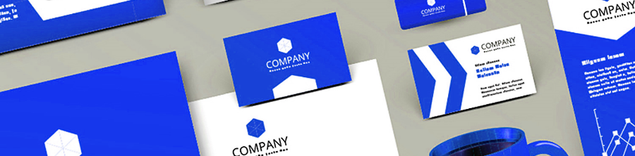
Your document’s primary aim should be to maintain the styles that are expected from company-produced materials. Let’s consider what kinds of materials these could be. These can be anything printed on paper or online, such as the logo, letterhead, business cards – but also extend into pens, notebooks, and of course, your website.
What is meant by ‘Style’?
It’s best to focus on the key design elements, such as colours, typography, grid, graphics, logo, and more. Colour is a central focus area and has even deserved special mentions within the ExtraHut community. As a refresher – your choice of colour scheme will leave a tremendous effect on your brand. I’ll leave it at that for now.
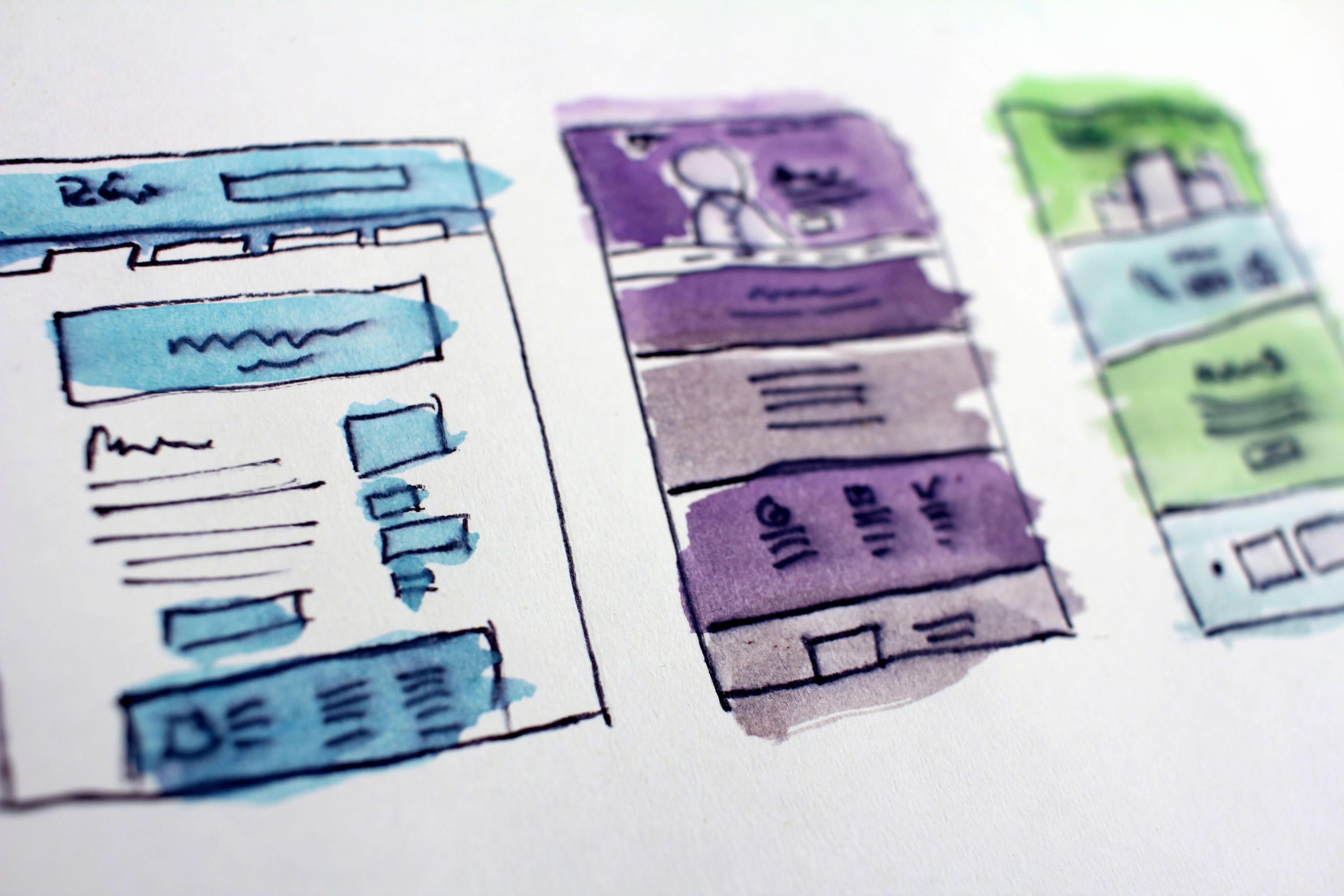
Style can also refer to imagery used to convey your brand identity. But in this case, even the most straightforward websites and imagery should abide by a consistent style. In that, line thickness, shading, and shapes should also remain somewhat correlated. Even the simplest deviations of style can reflect poorly on your brand – take, for example, the pencil icon below.

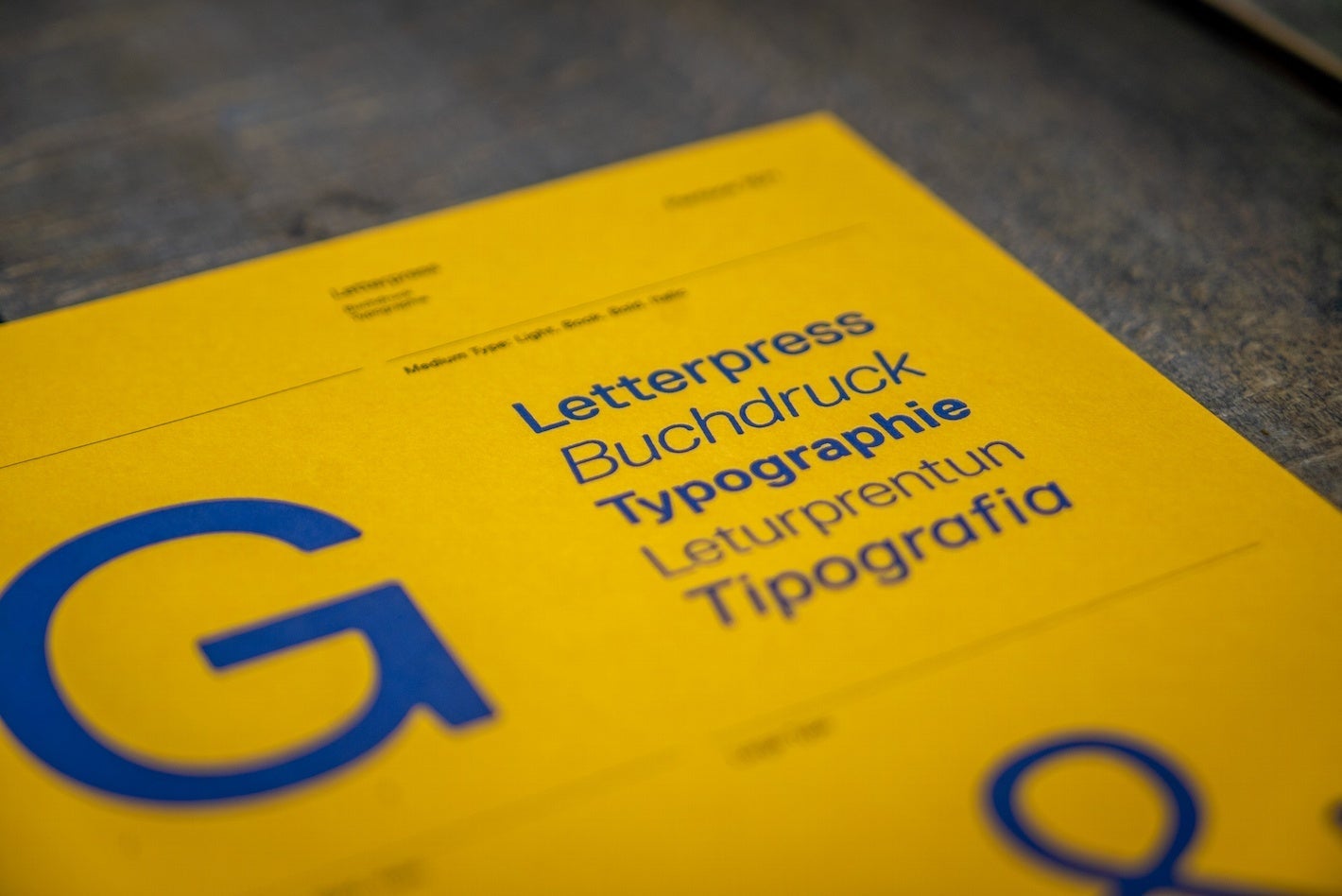
That, of course, goes for typography and branding too. A style guide can even extend into writing copy and even citing sources. You’ll probably note Style Guides for their role in crediting authors in written materials – think back to college days!
But no matter which colour scheme, imagery, or narrative styles you choose for your brand, you’ll need to maintain consistency across all mediums. That, in a nutshell, is what the Style Guide is and what it’s there for – keeping things in-line.
Great Style Guide Examples
The following is a selection of significant instances of the style guide. In each illustration, I have identified some key takeaways that make good headway into what to include in your guide.
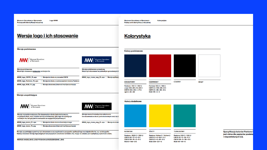
National Museum in Warsaw
A national museum, in any country, is a cultural institution. In that, it needs a set branding regime, just like any household brand. As you will see, (Poland’s) National Museum Warsaw demonstrates variations of its logo while also showing the exact colours used, complete with colour codes.

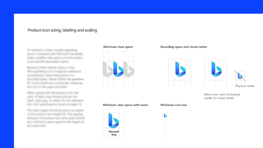
Microsoft Bing
Whether you’re ranked 1st or 31st on Alexa, any prolific search engine needs to define the parameters for using its logo. Like Microsoft Bing, your brand is no different in this case, as all icons and imagery should be well-presented, with exact proportions and pixel values.
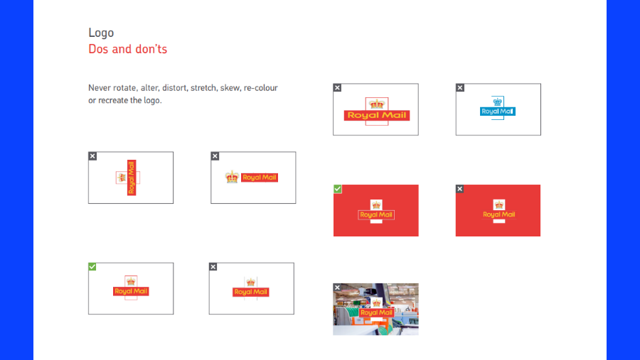
Royal Mail – United Kingdom
Branding can be a great creative exercise, but it’s good to set boundaries to keep the creatives on planet earth. As the UK’s postal service had demonstrated, not all contexts are ideal for its logo and colour scheme. In these cases, there’s no better way to define your brand’s limits than with an undisputed ‘do’s and don’ts’ page!
What should you do?
Get building! There’s no perfect way to create one, but it’s best to combine all the most vital elements of your branding to make it work for you. You should take examples from the above companies and bring them into the concept of your Style Guide.
Still unsure? Then don’t hesitate to ask some experts too! An effective UX or UI company can help take you through the elements needed and even demonstrate their prowess with their own in-house style guide.
A great partner will also lend a hand based on their experience and list the elements needed in maintaining a consistent design. When finally putting it together, be sure to make it your own. There’s nothing to be gained from lifting a template straight from the bowels of the internet. What’s most important is that the content, structure, and thought process itself reflects your brand.
Read up on our upcoming articles, where we’ll tell you all that you need to know about building style guides and why they’re the ultimate tool for your company. Think of it as a window into the soul of your exciting brand. With enough attention, your style guide can be the best of its kind in the world. Go for it!