
When designing a product or a service, you should first and foremost focus on its accessibility and intuitiveness. If the users don’t understand right away how to use your app, they will quickly abandon it and seek easier solutions.
How can you create a UI that responds to the way users interact with the product? One way is to conduct user research at the design stage. Testing your assumptions and discovering how people actually interact with your app will help you to improve the design.
You can, however, implement elements of your design that will themselves guide your users or enhance user interactions. These elements are called micro-interactions.
What are Micro interactions?
Micro interactions website wise, are often simple, single-purpose animations or messages that trigger feedback after users’ actions. Think of them as a way the system responds to the user, communicating the progress, errors, or simply offering some branded mechanism to strengthen its message.
Animation-based micro-interaction offer visual explanation of what has been done or what the user is expected to do. Think of Facebook like and emotions status, or animated dots in the Messenger app telling you that another person is typing their response.

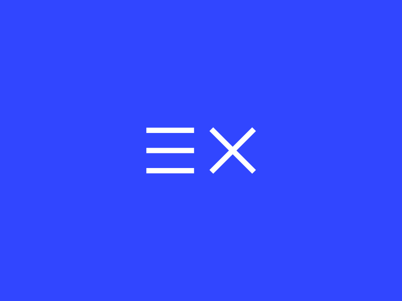
We’ve animated ExtraHut’s logo to show progress when loading a new page.
Progress bars and loading animations are another two examples you can commonly find in web and app design. On our own website, we’ve used the logo to represent the loading of a new page.
You can also use messages explaining the action to the user. Error messages are a notable example, and you can find them in contact forms or during sign-ups.
Why do We Need Them in Web Design?
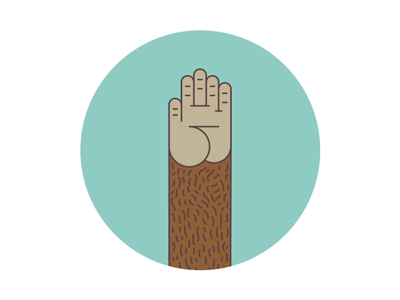
As I mentioned in the micro-interaction definition, they offer feedback to the user. They can, however, be a part of brand messaging. In MailChimp, a popular email marketing tool, after successfully completing a new campaign, users can give the brand’s hero a high-five. If you try this too many times, though, the monkey’s hand goes red, implying that it has enough of it.

Source: Pinterest
Micro-interactions can also guide users by highlighting required actions. This is especially important on mobile devices, where many actions can be achieved by using gestures. Scrolling up to refresh or swiping right or left to delete or archive an email in a mobile inbox are two micro interactions examples, but there are many other ways you can show your users around your app with mobile micro-interactions.
The guidance can also include handling errors. Whenever your user does something wrong, like mistyping an email, creating a weak password, or submitting a form without filling in required fields, you can use micro-interactions to notify them about the actions they need to take in order to complete a given step.
Explore some of these interesting micro-interaction design ideas to get you inspired!
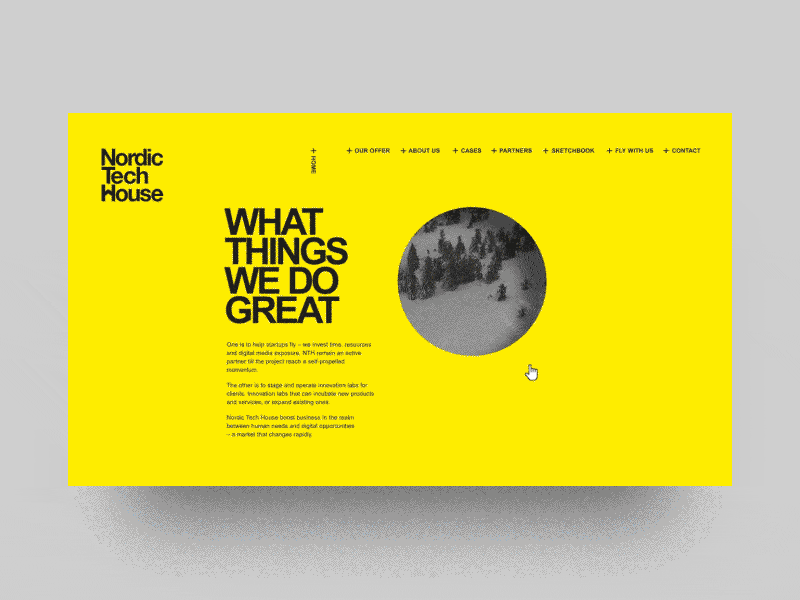
Read more about the design we did for Nordic Tech House.
What are micro interactions - user support rules:
Keep it simple
The general rule of design, in my opinion, is to keep things simple. Adding too many elements creates visual clutter and leads to overdesigning your product, which may annoy and discourage its users. Decide on one thing you want the animation to do and master it to perfection. Also, sometimes designing is more about removing elements instead of adding more and more stuff.
Make it clear
UX micro interactions are intended to guide your users and offer feedback, so they shouldn’t be confusing. If it’s a message, make it short and to the point. Whenever you use animations, make it clear what is the action behind them. Animated hovers, for example, may indicate that an element can be clicked on for further information.
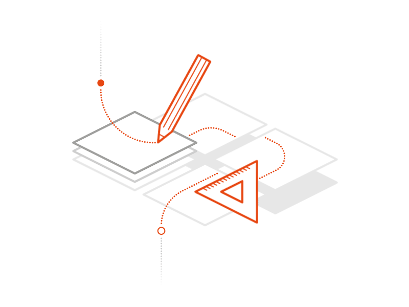
Micro-animations we designed for SoftwareHut.
Make it fun
User engagement increases the chance people will come back, so make their personal experience with your product unique. MailChimp’s high five interaction after sending a new campaign doesn’t provoke any new action – it is simply a moment to celebrate the completion of a process. Adding elements like this to your design will make it more thoughtful, personal, and engaging.
Perfect Your Micro-interactions
When you consider what are micro interactions – and ‘micro’ they should be, you should think about the most intricate aspects of visiting and navigating your website. The most effective user journeys provide an engaging, and comprehensive experience throughout even the most tedious customer procedures. The micro interactions website or app-based experiences involve, should always refer to your marketing and brand identity.
Creating beautiful, but more importantly, useful products are what every designer should strive to achieve. Focusing on details and creating the micro interactions UX focused results - is a way to accomplish this goal. The devil is, after all, in the details.
Adding a variety of micro interactions examples to your product design can be a challenge and should always be in line with the user research and its specification. If you need guidance, a team of experienced designers can help. At ExtraHut, we love all the little things making up to a great design. Let us know about your project, and let’s see how we can help you!