Thankfully, a leading academic publication on the subject, titled The Encyclopedia of Human-Computer Interaction offers a definition. Doug A. Bowman, the author of the chapter, 3D User Interfaces, describes this is a “Human-Computer interaction in which the users’ tasks are performed directly in a 3D spatial context.”
Spoiler Alert! Some interactions are not 3D UI.
The 3D spatial context can mean interacting within any 3D environment – real, or simulated. Just remember, one object should affect the other. Your movements must specifically affect corresponding objects. Your object’s 3D position and orientation should contribute to the movement - such as through yaw, pitch, and roll.
This means shapes and graphics should appear beyond the flat ‘paper-like format’ we associate with computer applications.
When 3D interactions do not equal 3D UI?
One example is when computers display a 3D space, such as an isolated animation, but is isolated from other functions.
- Another example is making indirect interactions, such as using 2D widgets, entering datasets, filling out forms, or selecting menu items.
Everyday Encounters of 3D UI
Despite its development and specifications, the process of 3D interface design has not evolved to such a great extent. 3D applications have stagnated, mainly in favour of hybrid systems such as Augmented Reality. Where they apply, however, has changed.
Desktop Computing
With such a broad scope of locations, you can view 3D interfaces almost anywhere. You can find this most easily using specified 3D orientation and object positioning using your computer mouse.
Most data can be visualised on a 2-dimensional chart, as seen on Office programmes. But some data can look a great deal better-presented in 3D. These can be graphs visualised along multiple axes and a virtual path, which can ‘immerse’ a viewer.
Enterprise design and production programmes are a particular focus area for 3D UI. In many cases, design programmes allow for direct interactions and adjustments to the future 3D project.
Video gaming is by far the most popular medium, emerging alongside mainstream access to personal computers’, before making their way to mobile phones. Today, you can tap into this kind of experience using almost any handheld device – but nothing beats the computer!
Mobile Applications
Your next ‘small screen’ will guarantee access to the 3rd dimension. Market competition means that adding navigation can provide depth and value to these devices’ limited parameters. Besides, what 3D brings to smartphones are captivating designs that augment your brand’s experience.
There’s much to explore here too! Gesture controls are a popular smartphone attribute that can help you to explore and navigate the processes guided by 3D graphics. It also adds a necessary window into a customer’s interaction with a brand.
Smartphones offer more to our lives than ever! Today, they’re vital to comfortable daily lives and workflows. The likes of GPS, gyroscopes, accelerometers, remote controls of equipment are just some of the options available – and they’re thanks to 3D UI.
Virtual Environments
A virtual world is a purpose-built digital universe, made for you to explore. Whether it’s your computer mouse, game controlled or hand-gesture control - the basic idea is to enable you to ‘fly’ or travel throughout the space.
Virtual Reality
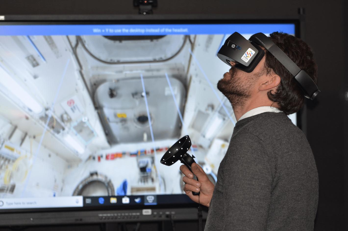
This is your textbook definition of 3D UI, and a popular way to immerse yourself within a digital world. Sensor-filled equipment recognises your physical movements, to correspond with the digital display. Your first thought might be video gaming, but this also includes business and industrial applications. While it is a very specialised technology, it offers entertainment applications to design simulations in live presentations.
Augmented Reality & Mixed Reality
By combining virtual objects with our physical world, it is possible to build links within both dimensions, yielding business value, such as IKEA Place, or immersive gaming experiences, such as Pokémon Go.
A hybrid form of digital experience is now possible, using inbuilt cameras combined with outputs of smartphones. Digital overlays, dubbed Mixed Reality, now makes it possible to view simulations within the virtual interface. This has become achievable with specialised visors and wearable technology.
Large Screen Displays
Where users once assumed large screens to be home devices, you can find 3D interfaces on grand projector displays. This is common on stadium screens, advertisements, billboards, and wall-display screens. In some cases, users can ‘zoom’ into a marked area by viewing that space.
With this being a popular feature in large screens, it helps replace static remote functions. It also provides an answer for when mouse and keyboard functions cannot stand the scale of larger screens. Some of which can stretch across buildings, stadia, or other urban structures.
A very effective solution is through gesture controls or freehand pointer controls. These aim to let your users interact within the digital field.
Ubiquitous and Pervasive Computing
Many solutions employ physical objects which trigger our digital devices. QR codes are a famous example. By scanning these prints, users can acquire information from public displays to their device. You can do this through hand gestures, ‘capturing’ of codes, downloading a chosen app, making automatic purchases, or viewing promotional materials. Anything is possible at this stage!
What You Should Do When Developing 3D Interfaces
Analyse and Emphasise
I can’t over-emphasise the need for planning.
With such high stakes, you must know your end-user and their expectations. We’re talking – age, occupation, what they love, what they hate – the nitty-gritty of market research will be your roadmap to a responsive product.
When looking into adding `depth to your existing product, take note of your users’ requirements. Their demands, when interacting with your product, will be essential in determining their user journey. After all, how best can a 3D User Interface provide for a more holistic user journey? If in doubt, your best bet is to know how this will provide your users and brand with long-term value.
What kind of hardware?
Think about how they will interact with a 3D display. Will it be through a mobile phone, or a specialised custom display? Consider this technology’s working environment too – will your user be an on-site architect, in a loud environment, wearing a safety helmet? On the other hand, do wish for this technology to be easy enough to navigate from the comfort of a living room?
How about Software?
Your choice in software is a trade-off between a custom or off-the-shelf solution. One is specialised software, developed from the ground-up. The other is a more mainstream product, developed for the general market. Dedicated software will demand resources but can add to your brand experience. Ultimately, your business needs, customer, and budget can help you make this decision.
Initiate Designs and Testing
There’s no need to overcomplicate things. When drawing up concepts for your UI, it can be a simple matter of, well – drawing. Consider the likes of sketches, storyboards, wireframes, or other preliminary designs.
Most of all, keep things as simple as you can. As you visualise your customer journey, draw the cleanest path from A to B, while also keeping with design principles. If you’re worried about possibly overdesigning – I have steps to avoid this, too.
You’ll also need to test your assumptions, with a dedicated focus group. Make sure to set up a controlled environment and insist on ‘brutal truths.’ As is often the case, the most loyal customers appreciate a chance to provide inputs. ‘Beta’ customers will share valuable, detailed comments. Not only will that help you perfect your design, but will also prepare a cohort of early adopters, to spread word of mouth.
Mind Your Conversion Funnel
Your objective is a conversion – to what is anyone’s guess. Whether you’re monetising a popcorn making game or reaching out to your virtual cosplay convention superfans – keep your eye on the objective. To put it broadly, look into the aspects of your 3-dimensional experience that will convert users.
As with many soon-to-be ‘old-school’ 2-D platforms, always remember at which ‘point’ along the user journey you want a ‘conversion’ to happen. Look into conversion scenarios or natural elements such as CTA buttons, or other immersive 3D feature.
In fact - the more aggressively you wish to gain conversions, the more your project should base designs around the conversion funnel. Your designs may take some time to align with your sales funnel entirely, so you should iterate and test nonstop. As with most digital projects, trial and error are essential to your process.
Reviews
An interface will need to face realities too. Objective testing, through Usability Reviews, will explore how well your 3D user interface will work with specific devices.
Think of these tests as a ‘splash of cold water’, onto any overreaching designs which would deter your users. Accessibility reviews will also cast light onto your use of colour, contrast, font size and types, as well as the qualities of any descriptive text. Nobody expects you to achieve perfect accessibility scores. Still, we can share some insights with you on designing your product with these qualities in mind.
Reviews can be subjective, which explains the importance of AB testing. Usage data are similarly essential metrics, with timed usage reports giving you an understanding into your product use. The 5-second rule can apply too, particularly when looking to secure conversions.
When all else fails, written feedback from the right people might be all you’ll ever need…
What Else Should I Do?
Games are your likely first point-of-call. I would begin by looking at industry-leaders or other inspiring designs. 3D UI isn’t readily available in many mainstream cases – but is very popular in video games.
With that said, industry tools, such as Holo4Labs refer to the hardware of Microsoft HoloLens 2. Using an AR-powered UI, lab technicians can view digital overlays that work in-line with digital instruments. As opposed to using the mouse, users will navigate a virtual menu through a specific hand gesture. That menu selection then relays the decision to a lab instrument in the real world.
Holo4Labs is a perfect example of 3D UI interaction principles, which I explained at the beginning of this article. For good inspiration, I would begin there.
Consider a team of experienced designers to help you achieve your 3D UI as well. My colleagues and I are just some of the human potential out there who are ready to make your ideas happen. Feel free to reach out!
Good luck, and see you in the better dimension!


