It’s time to define your branding power.
But the only way is through a great style guide. These documents are the leading publication, outlining quality, principles, and instructions for presenting your brand. Its job is to keep content consistent and to ensure a recognisable quality.
An effective style guide will be used by everyone, giving your team a tangible internal resource that will support your objectives. Thanks to your style guide, you’ll keep your brand under control and keep that company culture as strong as ever. Clients will also love evidence of your commitment to design practices.
Having read my last article, we have a pretty good idea of what is a style guide. Now, how do we build one for ourselves?
What Do You Need to Start?
Some brands can carry such weight that their style guides resemble a holy text!
No surprise here.
Many are so important that they command respect. It is the document to end all documents, after all! For maximum credibility of this guide, I recommend you involve various company departments with developing yours.
Style guides are to be accessed everywhere and by anyone. Don’t think of it as a single published document, kept inside a KGB bunker. As your brand evolves, it is also good to create this as an open-ended task.
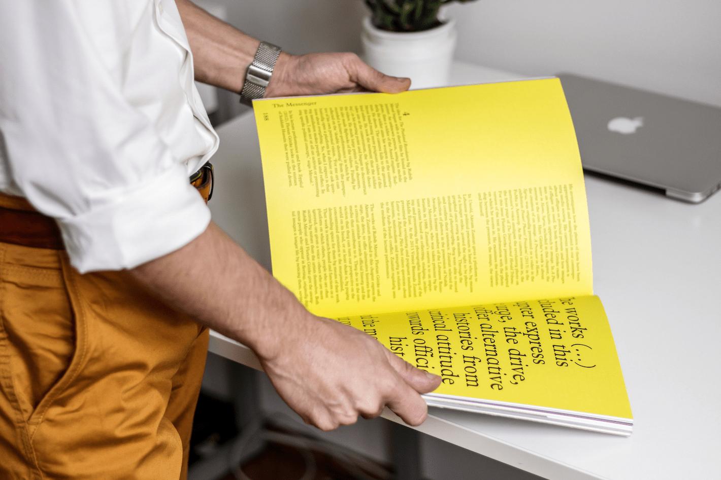
How you choose to detail it is your prerogative. Keep it brief or be meticulous – it’s relative. There’s no universal authority to determine perfect detail. Most great style guides go from 4 to 5 pages.
How to Build a Style Guide?
The following will be a rundown of how to approach the elements of your style guide.
Apply these elements at random, or even backwards! My advice is to have a read of this from top to bottom but to apply accordingly.

Begin with a Captivating Brand Story
Define your company mission, values, vision, core elements, and personality. Make sure to list what they are, in the formal sense, as defined by the management and founders of your company.
Look for:
- Our company manufactures wooden toys for young children.
- The organisation provides financial services for vegan-friendly kindergartens.
- My firm is a builder of recycled tire swings.
Avoid:
- We inspire millions with our can-do approach to molecular cooking.
- Our team breathes inspiration to billions of gum chewers across the world.
That list could go on forever…
The point here is not to gain the marketing departments ‘interpretation’ of your brand. Instead, look for a factual, ‘no bs’ version of what your company does.
Get Technical
Even if it rains, snows, or sandstorms - people should have no problem identifying you.
Create logo guidelines that shape the use of your company’s most precious and recognisable asset.
Well-defined technical include a list of ‘commandments’ on the proper usage of your logos. Make sure to include clear space rules and offer some acceptable colour variations for the emblem too.
Other definitive rules can include the minimum and maximum logo sizes, as well as the dos and don’ts of using your brand name and logo. For a great example of how the UK’s Royal Mail carries this out, see our article on that subject.
Read more: Build a Stronger Brand with these Style Guide Examples
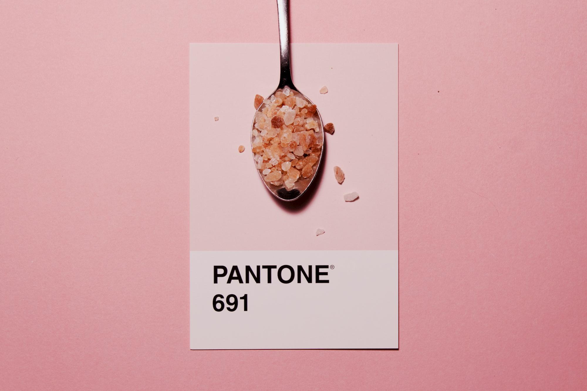
Decide on Your Colour Palette
In case you haven’t been here yet – you need to understand and clarify which colours really represent your brand.
Think of which core colours should always be visible when advertising your company. Which shade of blue or tint of orange truly represents you? Any question, even mundane, is relevant – as these selections may attribute your product for years to come.
When adding colours to the guide – it won’t be enough to say ‘orange’. Mandarin orange? Not specific enough. When it comes to the millions – and we’re talking millions – of registered shades and tints, so, you’ll have to get as detailed as you can. Apply universally understood hex codes and RGB values, and CMYK for print-only variants.
Note that colours will appear differently on the web and on paper!
Save your graphic designers from making mistakes, and avoid those accidental lawsuits!

Writing is Imagery!
Don’t judge a book by its cover. Do judge a word by its font. In this image-conscious world, a typography system will need to say just as much about your brand as traditional images.
Decide from elements that will make up your system and bring your brand to glory. Consider fonts, font sizes, letter spacing, and style application guidelines.
Also, are you after a universal font, or will your product branch out with situation-specific fonts too?
Choice of Voice
When you say something, you’re assuming a role. And when your brand makes a statement, does it come from a source of passion, liveliness, or fury? When your words personify your brand, they should, above all – be interesting. Just - for the love of peace - don’t be boring!
The tone of voice is one thing to remember but think of ‘who’ your brand is. Consider your target audience is as well – and how your messages resonate with that market segment.
What kind of syntax, spelling, and grammar rules would they expect you to follow?
Create messaging that connects with your audience, using a simple list of words you like and words you don’t. Make sure that these words also operate under a set of, yes - rules. Rules are good.
Include Your Imagery Guidelines
When using images in official materials, your logo and fonts are only as effective as their associations. Your brand might even suffer when using irresponsibly selected imagery.
Does your brand prefer simple imagery, or rather something symbolic? It’s good to pick something detailed, so long as the specifications are precise, select similar acceptable images in the future.
Photos and media that are inconsistent with your brand can disillusion your customers and take your brand off-message. Derailing a brand is easier than mounting it back on the tracks – and there’s no better way to sabotage than with a haphazardly-placed image of a mouse, lobster, or cat!
Choose a style, outline a concept, and decide on its composition within your marketing materials. Just remember to maintain a consistency in approach across all your platforms.
Words of Advice: Tips for Creating a Style Guide
When building a great style guide, there’s no way to define the best possible example. But a considered and measured approach is the healthiest advice I can offer.
As a last rite of wisdom – keep these thoughts in-mind too.
- Be concise – You’re going to start simple – because as the Royal Mail of the United Kingdom proves, it only takes a few pages to enforce even the most ubiquitous brands. In your case, I recommend 4-5 pages.
- Make it accessible – Remember, you’re building a guide that’s understandable for everyone, inside and outside your organisation. All someone should do is click to view your material. So, choose a simple programme that your target audience can access in a PDF document.
- Collaborate for best results – Style guides are a universal company tool. But sometimes, the only way to ensure every team member takes it seriously is by involving them. Where possible, ask for insights from different departments. Keep questions simple, and be ready to ‘filter’ inputs from your new helpers.
- Specify, if needed – Be as thorough or as general as possible. There’s no winning formula for how much detail you should explore. The more you specify, may mean greater consistency – but ultimately, this will be up to you. There’s no telling how much is ‘too much in this case, just so long as you define your initial styles.
Good luck!